
Commercial interiors have a different responsibility than homes. A living room can be quiet, even anonymous, and still feel inviting. A customer-facing business has to communicate more quickly. Before someone sits down, orders a drink, or speaks with the person behind the counter, the room has already introduced the brand.
At The Braxton Grooming Lounge in Ferndale, that introduction is unmistakable. Deep blue walls absorb the edges of the room, black barber chairs bring weight to the floor, and narrow lines of brass repeat across cabinetry, mirrors, curtain ties, and decorative details. Above it all, a coffered ceiling adds a layer of ornament that feels almost unexpected against the darker, contemporary palette below.
The storefront glazing changes the equation completely. Daylight pours through tall windows facing the street, illuminating a room that could easily become visually heavy if photographed without care. The challenge was not simply to show a barber shop. It was to preserve the atmosphere Braxton had already created—the contrast between shadow and daylight, polish and utility, restraint and personality—while still making the layout of the lounge easy to understand.
The Room Introduces the Brand Before the Sign Does
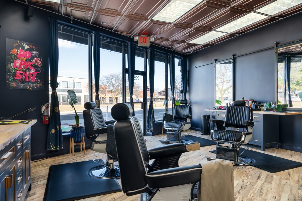
The first photograph begins wide enough to establish the entire front portion of the lounge. Multiple barber chairs sit across the open floor, each positioned on a dark mat and oriented toward individual workstations along the perimeter. The chairs repeat, but the room does not feel institutional. Their black upholstery and chrome bases are visually substantial enough to hold their own against the deep blue walls.
Along the windows, navy curtains are gathered with gold ties, while a subtle botanical pattern introduces another metallic accent. On the opposite side of the room, cabinetry is outlined with narrow brass detailing and finished with long gold hardware. These repetitions matter because they make the interior feel intentional. Brass is not limited to one decorative object; it moves through the space as part of a broader visual language.
The artwork near the storefront is less restrained. Bold pink lettering cuts across a dark floral background with a message that gives the room a sharper, more irreverent edge. It is one of the few bright areas of color in the interior, and for that reason it becomes immediately memorable.
Photographically, the temptation might have been to move closer and make the artwork the story. Instead, the wider composition allows it to remain where it belongs: part of the brand, but not the entire room.
The Ceiling Changes the Scale of the Interior
The coffered ceiling may be the space’s most unexpected architectural element.
From eye level, the barber chairs, mirrors, and cabinetry naturally receive most of the attention. Look upward and the character of the room shifts. Rectangular panels repeat across the ceiling in a rich brown finish, interrupted by large illuminated sections that spread a cooler, more even light into the lounge.
The pattern gives the ceiling depth. It also makes the room feel more composed than a conventional commercial shell with an exposed deck or simple acoustic grid.
In the wider photograph, enough of the ceiling remains visible to establish that rhythm. This was important because cropping too tightly around the workstations would have removed one of the interior’s strongest spatial features. The ceiling helps connect the separate barber stations into one room, repeating above them in the same way the chairs repeat below.
Commercial photography often becomes preoccupied with eye-level features: products, furniture, equipment, signage. Yet architecture exists above the customer’s line of sight too. At Braxton, the ceiling is part of the atmosphere whether a client consciously studies it or not.
The photograph needed to acknowledge that.
Daylight and Dark Walls Are Allowed to Coexist
Dark interiors can be difficult to photograph because there is often pressure to lift every shadow until the room looks brighter than it feels in person. At Braxton, doing so would have erased much of the lounge’s character.
The deep blue walls are meant to feel dark.
They create a backdrop for the brass details, make the mirrors more prominent, and allow the black barber chairs to sit within a tonal palette rather than stand apart from it. The storefront, meanwhile, introduces an entirely different quality of light. Large panes of glass bring Ferndale’s street activity directly to the edge of the room, creating a bright band along one side of the interior.
The photography works within that contrast rather than trying to eliminate it.
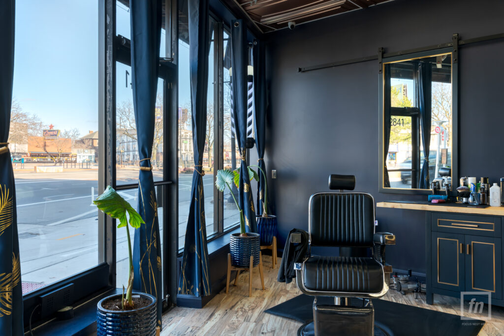
In the second image, a single barber chair sits against the window wall. The daylight outside remains visible, with the street, buildings, and recognizable commercial context beyond the glass. Inside, the chair, cabinetry, and blue wall retain their deeper tones.
This relationship between bright exterior and dark interior is part of how the room actually feels. A customer near the windows experiences both at once: the intimacy of the lounge and the movement of the city immediately outside.
Flattening those differences would have made the exposure more uniform.
It also would have made the photograph less honest.
One Barber Chair Can Explain the Experience
The second photograph reduces the room to a much simpler composition.
One chair. One mirror. One workstation.
After the wider image has explained the overall layout, this closer view allows the guest experience to come forward. The barber chair is centered prominently, with its ribbed black upholstery, chrome armrests, and substantial headrest creating a clear visual focal point.
Behind it, the workstation is practical rather than staged for a showroom. Clippers, brushes, bottles, and grooming tools remain visible on the counter. Cords fall beneath the work surface. The mirror reflects the opposite side of the room and a portion of the storefront.
These details matter because Braxton is an active workspace.
For commercial interior photography, there is a difference between clutter and evidence of use. Removing every tool from the counter might have produced a cleaner photograph, but it also would have stripped the workstation of its purpose. A grooming lounge should look ready to groom someone.
The objects on the counter explain the room.
The photograph simply organizes them.
The Mirrors Create a Room Within the Room
Mirrors present a familiar challenge in interior photography. They can reflect the camera, introduce unwanted visual clutter, or pull attention toward areas outside the intended composition. In a grooming lounge, avoiding them is impossible. Mirrors are fundamental to the space.
At Braxton, they also add another layer of architecture.
The large mirrors are framed in dark material with narrow brass edges, visually connecting them to the cabinetry below. Mounted on sliding hardware, they introduce an industrial detail that contrasts with the more decorative ceiling and gold accents elsewhere in the room.
In the second photograph, the mirror reflects the tall windows behind the camera. The result gives the workstation a greater sense of depth without relying on an exaggerated lens. The viewer sees the chair and cabinet directly, then catches another fragment of the lounge within the reflection.
The mirror becomes a secondary frame.
This is the kind of detail that can make commercial interior photographs feel more editorial. Rather than treating reflections only as technical problems to eliminate, the photographer can ask whether the reflection explains something useful about the room.
Here, it does.
The Street Is Part of the Interior
Braxton’s relationship to the street is difficult to separate from the design of the lounge.
The tall storefront windows occupy nearly the full height of the front wall, allowing the surrounding Ferndale streetscape to remain visible from inside. Curtains soften the glass without completely covering it, and the barber chairs sit only a short distance from the sidewalk beyond.
In the second photograph, the view outside becomes particularly important. The city is not reduced to a blown-out white rectangle. Buildings, trees, signs, and roadway remain visible enough to establish place.
For a commercial space, that context can be as meaningful as a close-up of cabinetry or décor.
Customers do not experience the business as a floating interior. They approach it from a sidewalk, see the storefront, enter from a particular street, and remain visually connected to the neighborhood while they are inside.
Showing that connection was especially important for a Ferndale business. The photograph does not need a graphic announcing the location in order to communicate that Braxton occupies an active commercial setting. The windows do much of that work naturally.
Commercial Photography Should Understand the Brand It Is Photographing
The Braxton Grooming Lounge is not a neutral space.
Its dark palette, gold details, oversized mirrors, coffered ceiling, black barber chairs, tropical plants, and unapologetic artwork all contribute to a very particular identity. Photographing the room as though it were a generic salon would miss the reason the interior is memorable.
The goal was therefore not to brighten every wall, remove every grooming tool, or simplify the space until it became universally appealing. The stronger approach was to identify the visual decisions the business had already made and organize the photography around them.
The wide view establishes the room’s hierarchy: ceiling above, barber chairs across the floor, workstations around the perimeter, and daylight along the street-facing windows. The closer photograph reduces that experience to one chair and one station, allowing the materials, tools, mirror, and relationship to the storefront to become more intimate.
Together, the two images move from brand environment to customer experience.
That is the distinction commercial interior photography should make. A photograph can document what a business looks like, but stronger imagery begins to explain why the space feels particular to the business occupying it.
