
From the street, 618 S Gainsborough is easy to understand at first glance and more interesting the longer you look. The house sits close to the sidewalk beneath a layered roofline, its pale exterior softened by deep green landscaping and a Japanese maple whose red leaves pull the eye toward the center of the façade. A compact covered entry is tucked beneath the front gable, while scalloped siding gives the porch and upper roofline a little more texture than the broader stretches of horizontal siding around them.
It is the kind of house that could be flattened by an overly direct photograph. Seen only straight on, the architecture risks becoming a collection of simple planes: roof, wall, door, windows. The opening sequence was therefore built around a gradual change in perspective. The first photograph establishes the façade and landscaping as a whole; the second moves to the side, allowing the roofline to gain depth and the driveway to draw the eye toward the detached garage. From above, the property finally reveals its full organization, with the house occupying the front of a long, narrow lot beneath a mature canopy.
That progression became the visual logic for the entire project. Rather than asking one photograph to explain everything, the gallery allows the house to reveal itself in stages.
A Small House With a Layered Silhouette
Royal Oak’s character homes often derive their presence from proportion rather than size, and Gainsborough is a useful example. The roof does much of the architectural work. Several intersecting pitches give the front elevation movement, while the small gabled entrance sits beneath a larger roof form that rises behind it. The result is a house that feels composed from the curb even though its footprint remains modest.
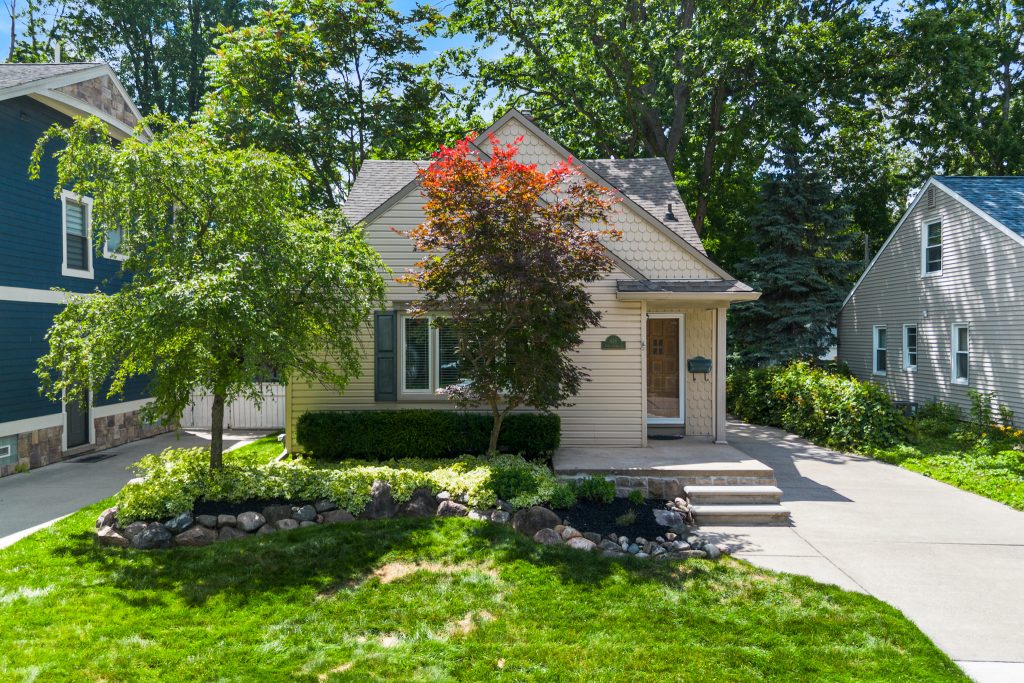
The trees and landscaping are equally important to that first impression. The Japanese maple partly overlaps the front window, while larger trees rise behind the roof and cast broken patches of light across the shingles. Instead of waiting for the façade to become perfectly and uniformly illuminated, the photography accepts the summer canopy as part of the setting. Bright lawn, shaded roof, and deeper greens in the background create layers that help the pale exterior stand apart.
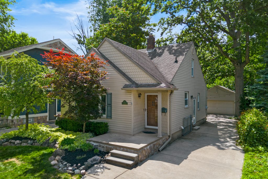
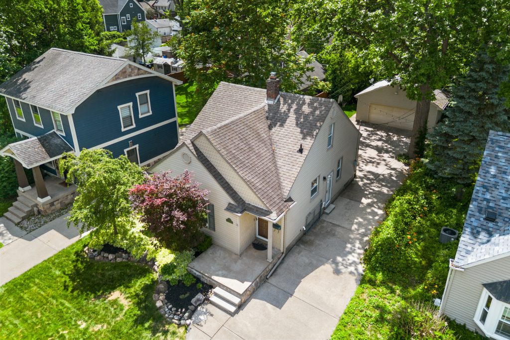
Moving closer to the entrance, the house becomes more tactile. The scalloped siding is easier to read, the wood front door shows its age and grain, and the green address plaque and mailbox introduce small details that disappear in the wider view. The porch itself is hardly expansive, but it performs the same architectural role as a much larger entry: it slows the approach and marks the point where the public face of the house becomes private.
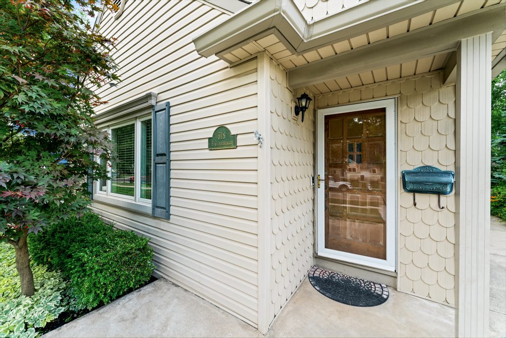
This was an important moment in the sequence. Before entering the living room, the camera pauses at the threshold.
The First Room Is Brighter Than the Facade Suggests
The interior immediately changes the mood.
From outside, the dense trees and layered roofline give the house a sheltered quality. Inside the living room, however, a broad front window brings in an abundance of daylight, reflecting softly across pale gray walls and dark hardwood floors. The contrast between the two is one of the room’s strongest visual elements. The floor provides weight; the walls and ceiling keep the space light.
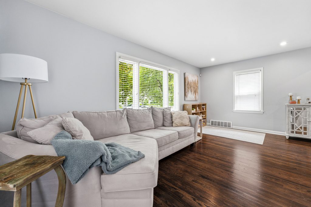
The first living-room photograph is deliberately generous, showing the sectional against the window and leaving a wide area of open floor visible in front of it. Furniture provides the scale. Without the sofa, the room might be more difficult to read, particularly in a wide composition. With it, the proportions become immediate: there is enough space to circulate comfortably around the seating while the room still retains the intimacy expected of an older Royal Oak home.
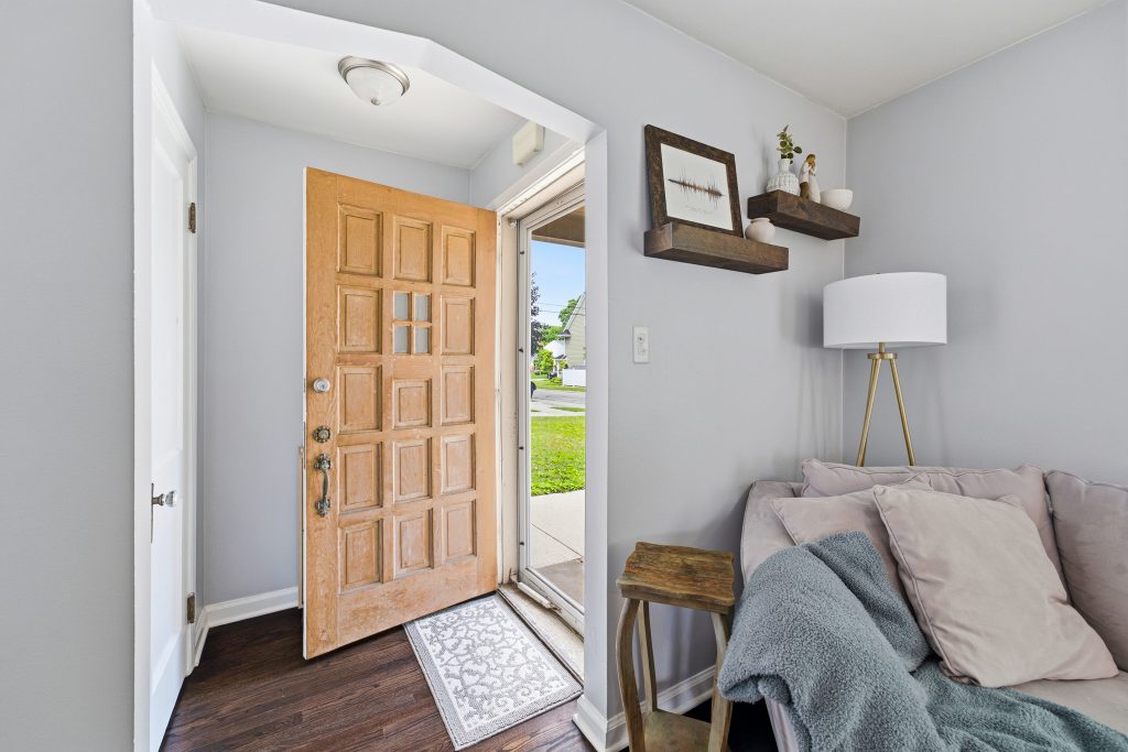
From the entry, the relationship becomes more personal. The original-looking paneled wood door opens directly toward the living area, and the photography allows both to occupy the same frame. This is less about documenting the door than showing what arrival feels like. Step inside and the living room is immediately present, not hidden behind a formal foyer or long corridor.
Reverse angles then explain how the room stretches toward the rest of the main floor. A broad opening at the rear begins to suggest the dining space beyond, while the continuation of the hardwood flooring creates a visual line through the interior. Nothing here depends on an exaggerated lens. The house feels open because the rooms are connected, and the photographs allow that connection to remain visible.
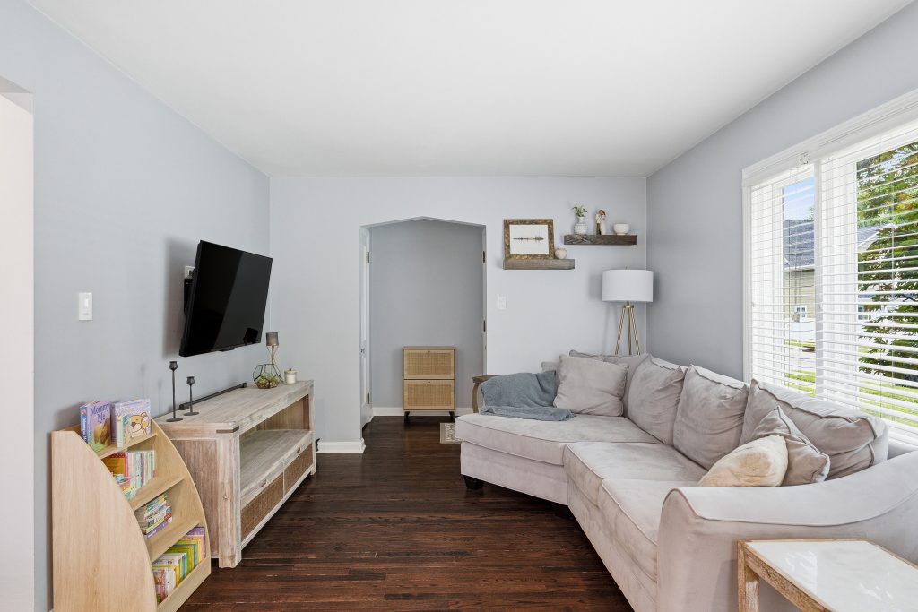
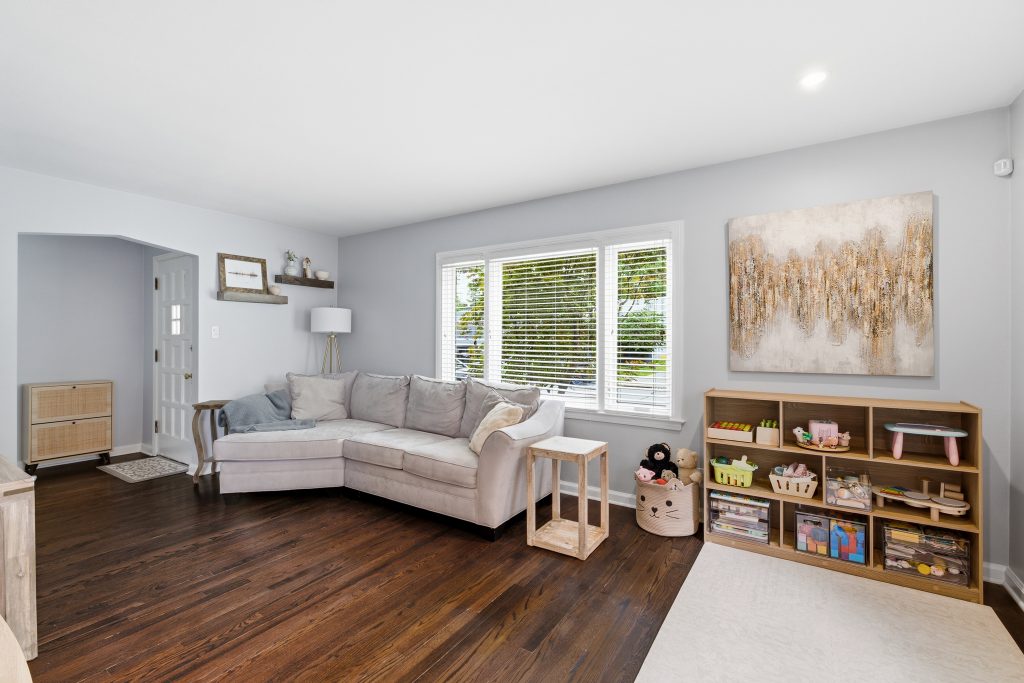
For Royal Oak listing photography, these transitions often matter as much as the individual rooms. A buyer may remember a bright living room, but understanding where that room leads is what begins to turn a collection of photographs into a sense of the house.
The Dining Room Is the Hinge of the Main Floor
The dining room occupies a particularly useful position in the layout. It sits between the living room and kitchen, functioning not only as a place for a table but as the spatial hinge of the first floor.
Photographed from one direction, the room feels composed and symmetrical, with the table centered beneath a large wood-framed mirror and the living room reflected behind it. The mirror becomes an unexpected storytelling device. It extends the visual sequence backward, allowing a glimpse of the room the viewer has just left without requiring another wide-angle composition.
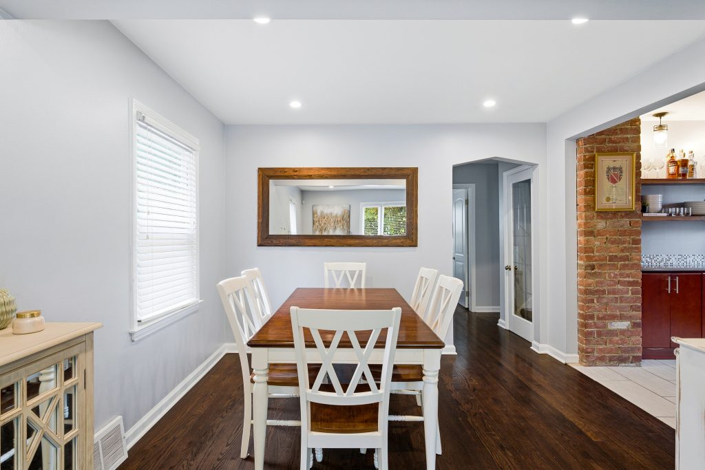
Turn toward the kitchen and the atmosphere changes. The clean gray walls and dark flooring give way to an exposed brick pier at the edge of the opening. Suddenly, a material with far more texture and history enters the frame.
That brick element is small in relation to the room, but visually it carries considerable weight. It marks the transition between dining and kitchen, creates a warmer counterpoint to the gray interior palette, and gives the main floor a detail that feels particular to this house.
The photographs do not isolate the brick immediately. It first appears at the edge of the dining-room composition, almost as a preview. Only after moving into the kitchen does its role become fully apparent.
Brick Gives the Kitchen Its Character
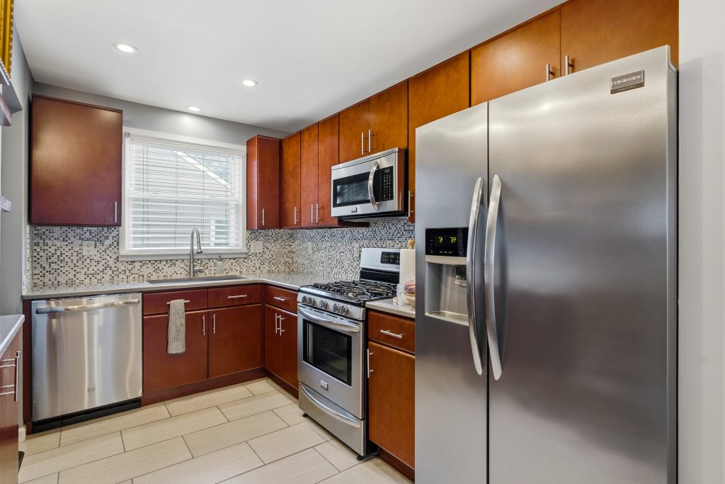
The kitchen is compact, but it is not visually simple. Warm wood cabinetry lines the room, stainless steel appliances introduce cooler reflective surfaces, and a small mosaic backsplash creates a fine pattern behind the counters. The first photograph is made from the doorway, where the layout can be understood quickly: cabinetry wraps the perimeter, the sink sits beneath the window, and the refrigerator and range occupy the opposite wall.
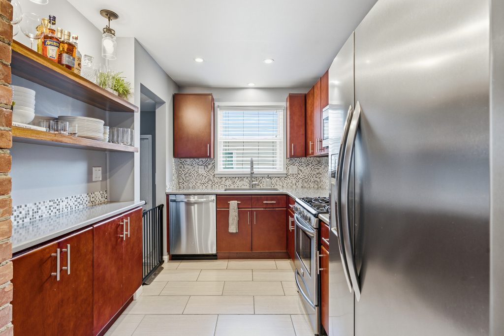
A second view lengthens the room. Here, the galley-like proportions become more obvious, but so does the amount of functional storage. The photograph does not attempt to stretch the kitchen into something it is not. Instead, the long sightline allows the cabinetry, appliances, and work surfaces to build rhythm from foreground to background.
Then the camera turns.
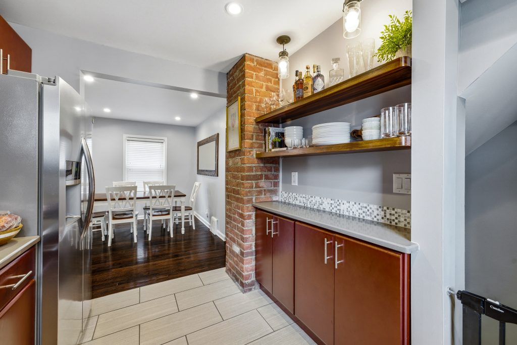
The exposed brick reappears, now accompanied by substantial open wood shelving and additional cabinetry along the opposite side. In this direction, the kitchen feels less like a narrow collection of appliances and more like a room with its own material vocabulary. Bottles and glassware occupy the upper shelf; dishes line the one below. The brick pier separates these open shelves from the dining area beyond without closing either space off completely.
This is the image that best explains the kitchen’s character. The stainless appliances matter, as do the counters and storage, but the brick and shelving are what make the room visually memorable. From this angle, the photograph also reconnects the kitchen to the dining room, continuing the sequence established earlier.
The house is compact, but the gallery never treats compactness as a problem to solve. Instead, the photography focuses on adjacency: living to dining, dining to kitchen, kitchen back toward dining. The rooms feel larger in context because the viewer understands how they participate in one another.
The Quiet Rooms Stay Simple
The main-floor bathroom and bedrooms ask for a quieter approach.
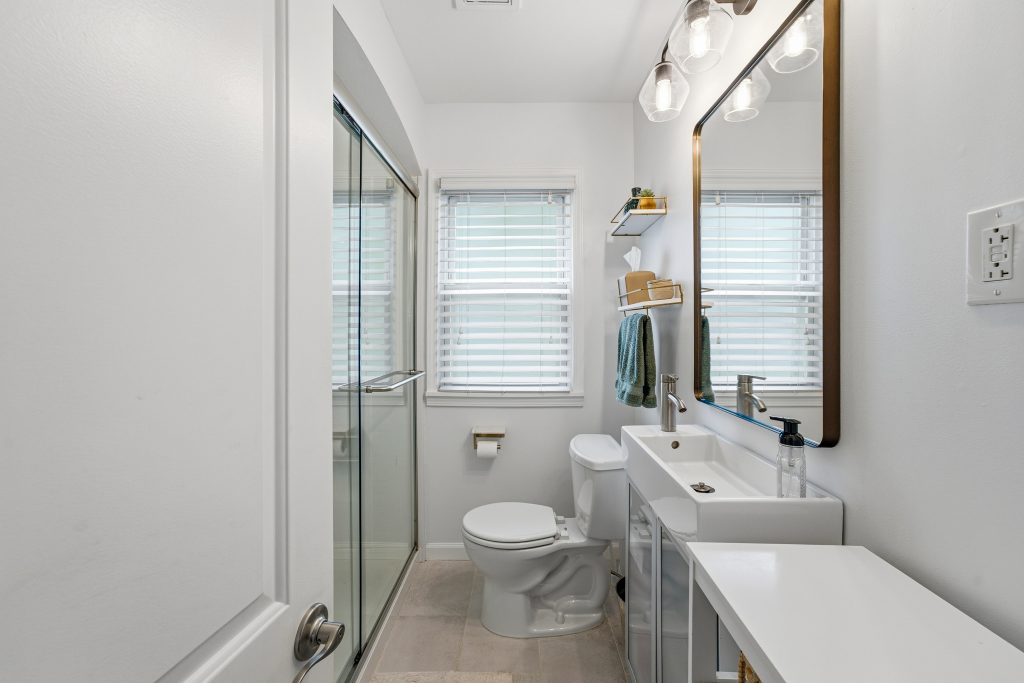
In the bathroom, a glass shower enclosure runs along one side of the room while a white vanity, large mirror, and window reflect light across an otherwise restrained palette. The composition is direct, but enough wall is left visible to keep the photograph from feeling compressed. A small bathroom does not become more useful when perspective makes the vanity appear six feet away from the shower. Clarity is more persuasive.
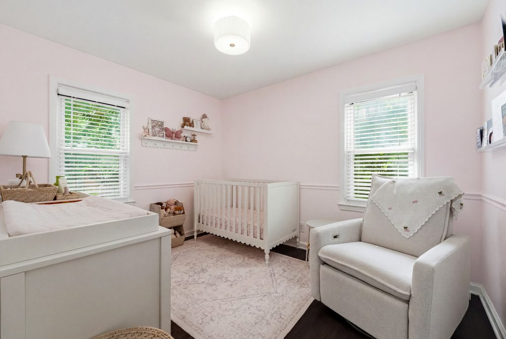
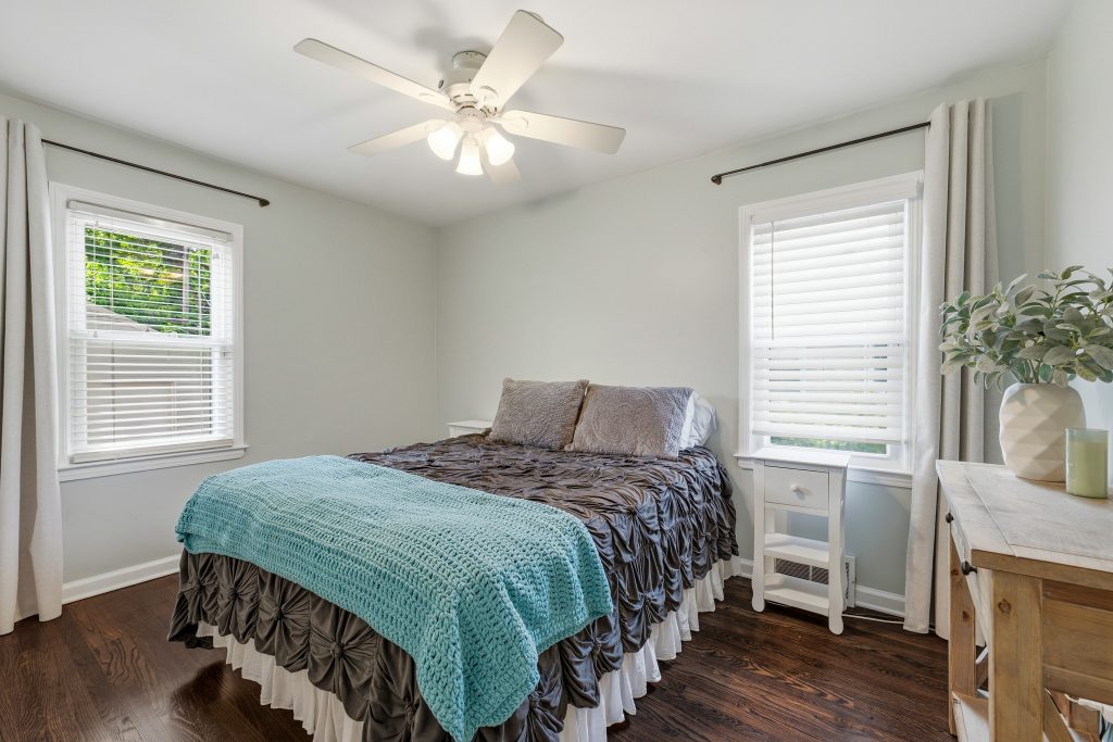
The two main-floor bedrooms are similarly straightforward. One has been used as a nursery, its pale pink walls, white furniture, and pair of windows creating a softer atmosphere than the gray living spaces outside. The other is furnished more simply, with a bed positioned between two windows and the dark hardwood floor continuing beneath it.
These rooms do not need dramatic descriptions because their role within the house is already clear. The photography establishes scale, natural light, and placement, then moves on.
That change in pace is intentional. A portfolio becomes exhausting when every room is photographed as though it were the most important space in the property. Some rooms are memorable because of a material or architectural gesture. Others benefit from being shown plainly.
The more unusual reveal is still upstairs.
Upstairs, the Roofline Becomes Interior Architecture
The staircase leads into a second floor that feels markedly different from the level below. Here, the roofline visible from the street becomes part of the interior.
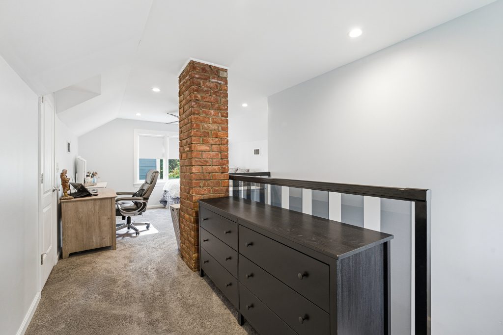
Sloped ceilings angle inward from the exterior walls, while a tall exposed brick chimney rises through the center of the space. The brick is the same material glimpsed near the kitchen, but upstairs it takes on a different role. Rather than marking a transition between rooms, it becomes a vertical object around which the upper level is organized.
The first photograph allows the brick chimney to divide the frame. On one side is a desk and work area; beyond it, a bed is partly visible beneath the slope of the ceiling. On the other, a low railing opens toward the stair below. The room is not photographed as a conventional rectangular bedroom because it is not one. Its irregular geometry is precisely what makes the space interesting.
A second photograph moves deeper into the sleeping area, where the ceiling lowers toward the exterior wall and the window sits beneath the slope. The composition is intentionally restrained. There is no attempt to straighten the room into a shape it does not possess. The angled ceiling remains visible, allowing the viewer to understand the relationship between the roof and the space beneath it.
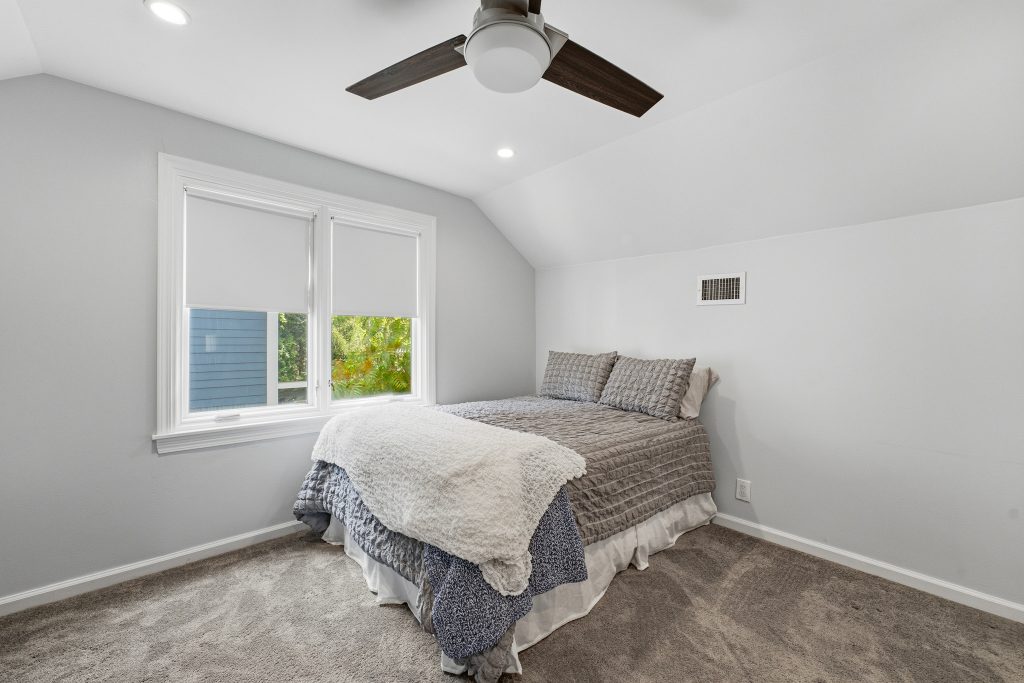
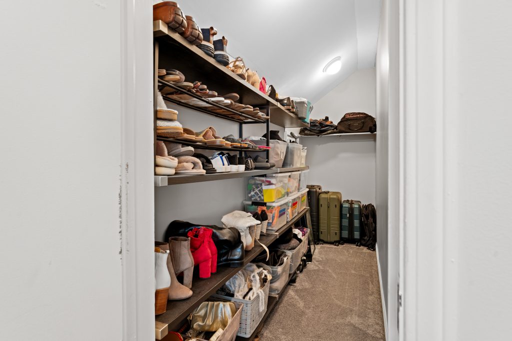
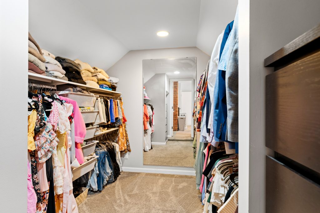
What initially appears from the ground floor to be a modest upper room is also accompanied by substantial storage. One walk-in area is lined with shoe shelving and luggage; another opens into a broader wardrobe space with hanging storage on both sides. These are practical photographs, but they change the viewer’s understanding of the upper floor. The room is not simply a finished attic tucked beneath the roof. It occupies almost the full second level, with storage spaces extending beyond the main sleeping area.
The floor plan will eventually make that arrangement explicit. The photography lets the buyer discover it first.
The Basement Is Allowed to Be a Basement
Downstairs, the architectural language changes abruptly.
There is no hardwood flooring, no broad front window, and no attempt to disguise the infrastructure overhead. Portions of the ceiling are finished with suspended panels, while other sections expose ductwork and structural framing. Gray walls and light carpeting establish a relatively neutral backdrop, but the room remains unmistakably below grade.
That honesty is useful.
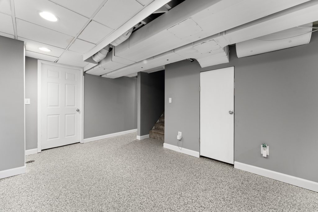
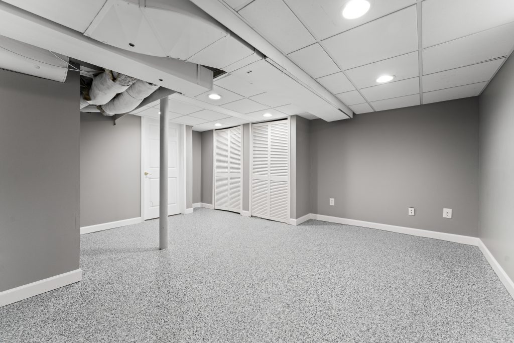
The first basement compositions concentrate on the open recreation areas, using the distance between walls and columns to show how the floor can accommodate different functions. Storage doors, the stair opening, and ceiling conditions are allowed to remain visible. Rather than cropping around these elements, the photographs use them to explain the space.
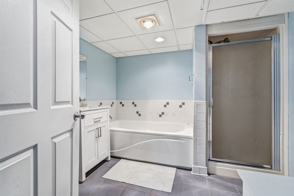
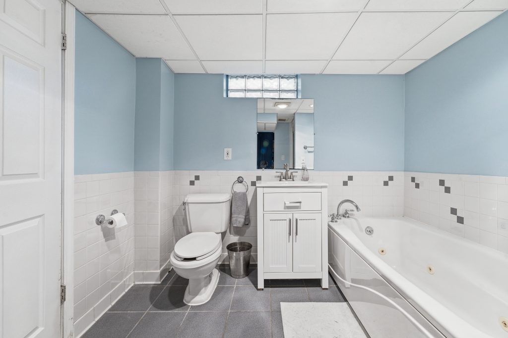
A full bathroom introduces another layer of utility. Blue walls and white tile surround a jetted tub, while a separate shower occupies the opposite corner. The room is photographed from both directions because one view alone cannot explain the layout. The first shows the tub and shower together; the reverse angle clarifies the vanity and toilet while revealing the glass-block window above.
Another lower-level room is currently used for exercise and storage. The treadmill, desk, and basement windows make its present purpose evident, but the photograph is less concerned with staging an ideal lifestyle than documenting usable space. Buyers can see what is there and decide what they would do differently.
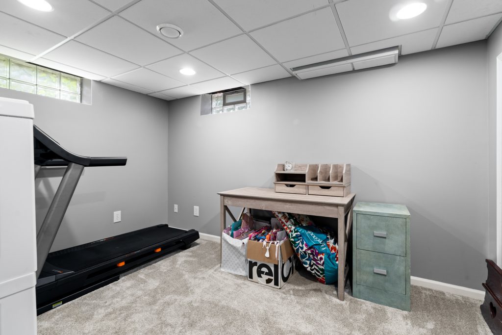
This is an important distinction in real estate media. Flexibility is more convincing when the room itself is clear. The photographer does not need to digitally invent a gym, office, or entertainment lounge if the scale and physical conditions are already understandable.
The basement is allowed to be a basement. It simply happens to offer more room than the exterior of the house initially suggests.
Behind the House, the Lot Becomes a Series of Rooms
The backyard provides one final shift in scale.
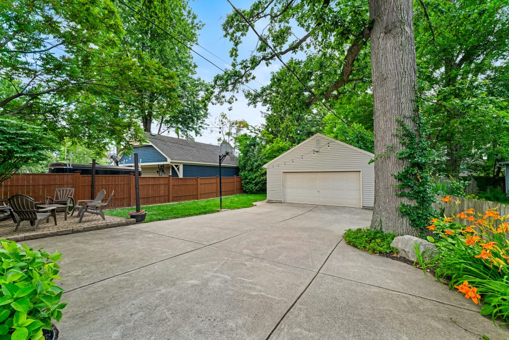
From the rear of the house, a broad concrete drive extends toward the detached garage, interrupted by mature trees, landscaped beds, and a narrow strip of lawn. At first glance, the amount of paving is prominent. Yet the wider photograph also reveals why it matters: the driveway is not merely a route to the garage. It forms the circulation spine of the rear property, connecting the house, outdoor seating area, and secondary structure.
Move closer to the patio and the character of the yard changes completely.
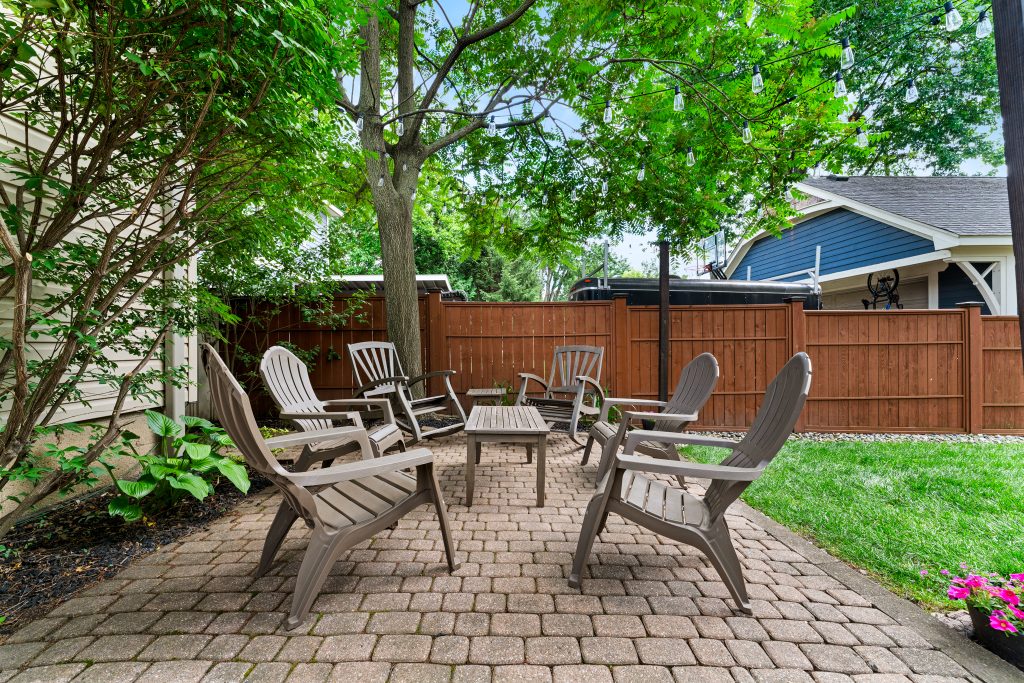
Beneath the canopy, a group of chairs gathers around a low table on a paved surface. String lights stretch overhead. A wood privacy fence establishes one edge of the space, while mature shrubs and the side of the house frame another. The area is compact, but it reads unmistakably as an outdoor room.
This is precisely why small backyards benefit from visual sequencing. A single wide image might have described the lot as a driveway, garage, lawn, and fence. The closer view gives one part of that same yard a clear function. The viewer no longer sees leftover space beside a garage. They see a place to sit.
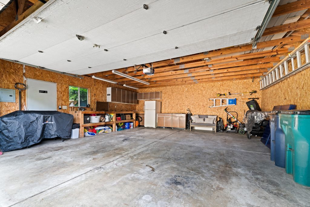
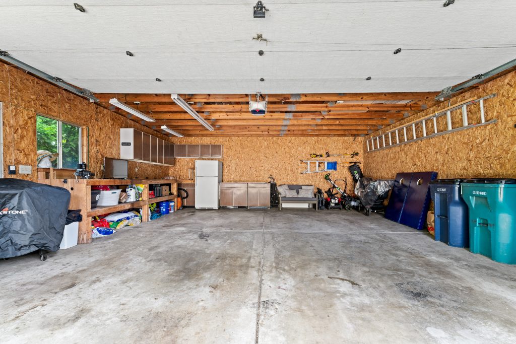
The detached garage then becomes a room in its own right. Its interior is broad and utilitarian, with exposed framing, work surfaces, cabinets, a refrigerator, tools, and enough open concrete floor to make the scale immediately understandable. Again, the photography resists unnecessary staging. The garage is working space, and the objects inside help show how generously it is being used.
Returning to the yard from the opposite direction, the house can finally be seen from the rear.
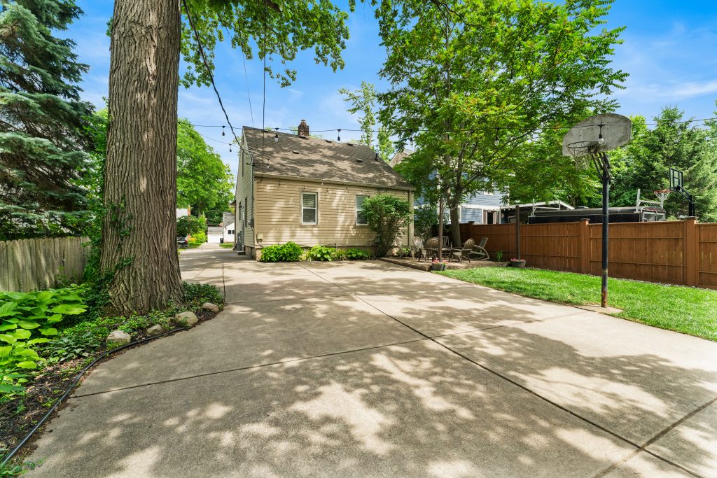
Mature trees dominate the property, their shadows spreading across the drive and the back elevation. From here, the roofline appears simpler than it did from the street, and the relationship between the house and patio becomes easier to understand.
The property has now been viewed from both ends.
The Aerial and Floor Plan Put the House Back Together
Ground photography is good at experience. It shows the texture of brick, the filtered light beneath a tree, the way one room opens toward another, and the point at which a patio begins to feel like an outdoor room.
It is less effective at explaining the entire site at once.
The top-down aerial provides that missing piece. A yellow outline follows the long, narrow property from the sidewalk to the rear lot line, placing the house near the front and allowing the garage, driveway, and dense tree canopy to be understood in relation to one another. The image is almost diagrammatic. After moving through the yard photograph by photograph, the viewer can finally see why those spaces felt sequential.
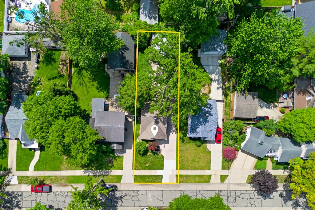
Pulling higher, the property becomes part of the surrounding Royal Oak neighborhood. Roofs sit beneath an extensive canopy, narrow lots repeat along the street, and mature trees often occupy as much of the aerial view as the houses themselves. This broader image is not intended to make a vague lifestyle claim about the city. Its value is geographic and visual: it shows the residential fabric surrounding the project.
Then the floor plan brings the story back inside.
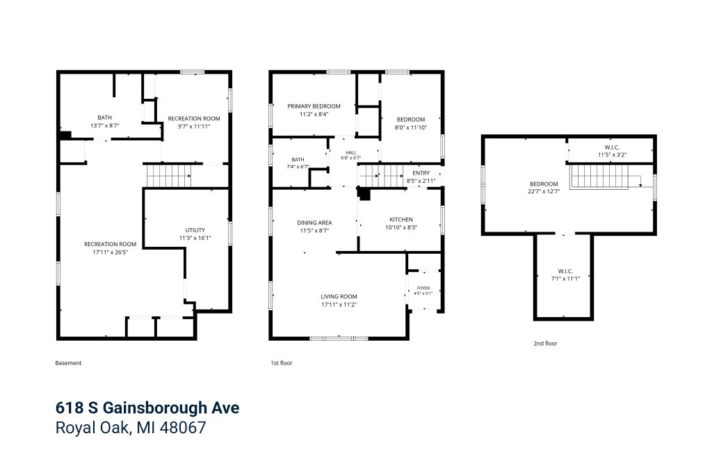
The living room stretches nearly eighteen feet along the front of the first floor before opening toward the dining area. The kitchen sits beside it, compact and clearly defined. Two bedrooms and a bath occupy the opposite half of the level. Below, recreation spaces, a utility area, and the second bathroom spread across the basement. Upstairs, the large bedroom occupies almost the entire second floor, joined by two walk-in storage areas.
The plan explains why the photographs were arranged as they were. The living room and dining room needed to be shown in relation because they sit directly beside one another. The kitchen sequence needed a reverse view because the room connects back toward the dining area around the brick pier. The upper level required several photographs because its geometry and storage are difficult to describe from a single position.
Photography introduced the spaces one at a time. The floor plan allows the viewer to assemble them.
Photographing the House That Is Already There
What makes 618 S Gainsborough compelling is not one dramatic architectural feature. Its character accumulates.
It begins with a layered roofline beneath mature trees and a small entry detailed with scalloped siding. Inside, dark hardwood floors carry the eye from a bright living room toward the dining area, where exposed brick begins to announce the kitchen. Upstairs, that same brick rises through a large bedroom shaped by the roof above. Below grade, the house opens into a series of practical recreation spaces and a second bathroom. Behind it, a long driveway connects a shaded patio to a substantial detached garage.
The photography followed those relationships rather than trying to make every room look larger, brighter, or more luxurious than it was. Wide compositions were used when they explained how spaces connected. Closer photographs appeared when a material or detail deserved attention. Aerial photography clarified the lot, while the floor plan completed the sequence by showing how the entire house fit together.
That approach is central to our Royal Oak listing photography. A property does not need to be transformed into something else to hold a buyer’s attention. Often, the more interesting work is learning how to read the house that is already there—and then arranging the photographs so someone scrolling online can read it too.
