
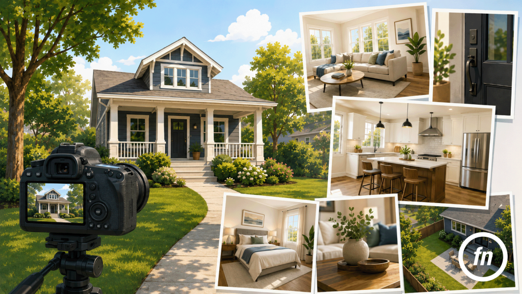
Professional listing photos rarely depend on one dramatic trick. Their quality is usually built through a series of quieter decisions: where the camera is placed, how much of the room enters the frame, whether the walls remain straight, and how daylight is balanced against the lamps inside. When those decisions work together, the photograph feels calm and believable. The buyer is not distracted by the technique because the property itself remains easy to understand.
That distinction matters. A listing photograph is not simply meant to make a room look attractive; it should explain the room without exaggerating it. The best images preserve scale, reveal how spaces connect, and direct attention toward the features that give the home its identity. NAR’s 2025 staging research found that 83% of buyers’ agents believed staging helped buyers visualize a property as their future home, reinforcing how strongly presentation influences the way a house is understood online.
Here are ten details that consistently separate professional listing photos from images that merely document a room.
1. The Camera Is Stable
Sharpness begins before the shutter is pressed. A sturdy tripod keeps the camera steady during the longer exposures often required indoors, where natural light may be limited and a faster handheld shutter speed would force the image to become noisy, dark or unusuably blurry. A geared head tripod allows for minute adjustments to really nail the composition and ensure that true verticals are present.
More importantly, a tripod creates consistency. The camera can remain at a similar height from one room to the next, horizons are easier to level, and small compositional adjustments can be made without rebuilding the photograph each time. A mirrorless or DSLR camera provides greater control over lenses, exposure, and image files, although equipment alone does not make an image professional. A well-used tripod and thoughtfully placed camera matter more than an expensive body held carelessly.
2. The Lens Is Wide, but Not Too Wide
A wide-angle lens allows the camera to include more of a room, which is particularly useful in kitchens, bathrooms, and smaller bedrooms. The danger is assuming that wider is always better.
An ultra-wide view can stretch furniture, pull walls apart, and turn a modest room into something that bears little resemblance to the experience of standing inside it. NAR specifically cautions against using wide angles so aggressively that small rooms appear unrealistically large.
For full-frame cameras, lenses in the general 14–24mm or 16–35mm range are common, but the correct focal length depends on the room and composition. The objective is not to fit every wall into every photograph. It is to include enough information to explain the space while keeping its proportions credible.
A moderate wide-angle image, generally in the 24mm range often feels more polished because it does not announce the lens or elongate the edges of the frame as dramatically as a 14mm shot would.
3. The Angle Explains the Room
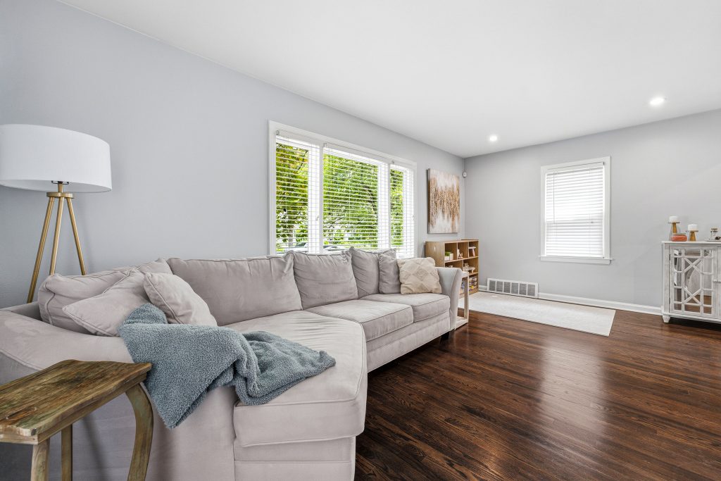
Corners and doorways are useful camera positions because they naturally create depth. From those locations, the eye can often follow one wall into another and understand where the room opens toward adjacent spaces.
Yet professional composition is not governed by a rule that every room must be photographed diagonally. A straight-on view can be powerful when a room has symmetry, a centered fireplace, a carefully designed kitchen elevation, or a distinctive architectural feature. The important question is not whether the camera is angled, but what the chosen perspective explains.
A doorway photograph may reveal the connection between living and dining areas. A corner view can show the scale of a bedroom. A centered composition may give cabinetry or a fireplace the visual authority it deserves.
The strongest compositions are not simply the widest ones. They are the photographs that make the porch, room transitions, and compact proportions of a home legible.
4. The Camera Height Feels Natural
Camera height affects how much floor, ceiling, furniture, and cabinetry appear in the frame. Placed too high, the photograph can look down into the room, emphasizing furniture tops and floors while making the walls feel shorter. Placed too low, tables and counters begin to block the view.
A position around four to five feet from the floor—sometimes described as waist, chest, or light-switch height—is a useful starting point. It tends to produce a balanced relationship between floor and ceiling while keeping furniture at a familiar eye level.
A kitchen may require the camera to rise slightly so the countertops remain visible – this is where utilizing a tilt-shift lens can be great as you can raise the camera height to eliminate the underside of kitchen cabinets and then shift the lens downwards to ensure that there is a proportionate ratio of floor and ceiling in the frame.
A bedroom may benefit from a lower position that gives the bed greater presence. Consistency is important, but judgment is always better than rigidity.
5. The Walls Stand Straight
Few details make a photograph feel amateur more quickly than leaning walls.
When the camera tilts upward or downward, vertical lines begin to converge. Door frames angle inward, cabinets appear to fall backward, and the entire room develops a subtle sense of instability. A leveled tripod helps prevent the problem at capture, while perspective-correction tools can refine minor issues either during editing or by utilizing a proper tilt-shift lens in the field.
Straight verticals do not make a photograph feel clinical. They allow the architecture to retain its structure.
This becomes especially important in historic homes, where door casings, stair rails, masonry, windows, and millwork are often central to the visual story. As discussed in Historic District Listings Need Detail, Not Drama, careful framing gives those materials authority without requiring exaggerated angles or theatrical editing.
6. More Than One View Is Used When the Room Needs It
A single photograph may introduce a room beautifully and still fail to explain its layout.
Main living spaces often benefit from two or three carefully differentiated views: one establishing the room, another showing its connection to the next space, and perhaps a closer composition highlighting a significant feature. The photographs should add information rather than repeat the same perspective from slightly different positions.
Professional photographers commonly capture multiple angles of important rooms because buyers need to understand flow as well as appearance. Smaller bathrooms or utility rooms may require only one image, while a connected kitchen, dining, and living area may need several.
The gallery should feel like movement through the home, not a stack of unrelated rectangles.
7. Natural Light Is Used Deliberately
Opening curtains and blinds is one of the simplest ways to improve an interior photograph. Windows become visible architectural features, rooms feel more open, and the source of daylight becomes understandable.
But more sunlight is not automatically better. Harsh midday light can create bright patches on floors and deep shadows beneath furniture – to mitigate this, utilizing a polarizing filter is extremely beneficial as they essentially eliminate reflections. Overcast conditions often produce softer, more even illumination, while early or late daylight may bring warmth to exterior materials and landscaping. Don’t fret if the sun isn’t shining – overcast skies are a useful diffuser rather than a photographic failure.
The best timing depends on the home’s orientation. A front exterior that faces east may be strongest in the morning; a west-facing façade may require afternoon light. Professional planning considers where the sun will be, not simply whether the forecast says clear.
8. Interior Lighting Is Consistent
Turning on lamps and fixtures can bring warmth to dark corners and make the house feel inhabited. The problem arises when every bulb produces a different color.
A warm table lamp, cool LED ceiling fixture, greenish fluorescent tube, and blue daylight window can create four competing color temperatures in one frame. Editing can reduce the conflict, but it cannot always make mismatched lighting feel natural.
Before the shoot, burnt-out bulbs should be replaced and visible fixtures should use reasonably consistent color temperatures. In some rooms, all lights may be turned on. In others, a photographer may switch them off and rely on window light, flash, or a blended technique to preserve cleaner color.
There is no universal rule that every fixture must be illuminated. The professional decision is the one that produces the most natural and consistent room.
9. Exposure Preserves Both the Room and the Windows
Interior photography often contains two very different levels of brightness: the comparatively dark room and the daylight outside. A single exposure may render the interior correctly while turning the windows white, or preserve the outdoor view while leaving the room in shadow.
HDR bracketing captures multiple exposures that can be blended into one balanced image. Flash can also introduce controlled light into the interior, while a flambient workflow combines flash and ambient exposures to retain both natural atmosphere and accurate color. Opendoor’s current guidance notes that flash and blended techniques can help manage the color and exposure imbalances created by bright windows and warm interior bulbs.
The finished image should still contain believable contrast. Bright windows do not need to look like dark television screens, and every shadow does not need to be lifted until the room becomes flat. Professional exposure preserves detail while allowing light to behave like light.
10. Editing Polishes Reality Rather Than Replacing It
Editing should refine the photograph: straighten lines, balance exposure, correct color, reduce lens distortion, and remove temporary distractions that do not materially change the property.
It should not quietly rewrite the house.
Stretching a room, removing permanent defects, altering finishes, or changing the view can create expectations the property cannot meet. Virtual staging and sky replacement may be useful marketing tools, but they should remain consistent with applicable MLS rules and be disclosed where required. NAR’s consumer guidance similarly cautions that virtual staging should be used carefully and that scale and presentation must remain credible.
Professional editing is often less visible than poor editing. Whites look neutral rather than blue or orange. Windows retain detail. The walls remain straight. The photograph feels finished, but not artificial.
Professional Photos Tell the Property in Sequence
The individual image matters, but the full gallery matters more.
A strong listing usually begins with the exterior, moves through the entry and primary living spaces, introduces the bedrooms and bathrooms, then continues toward the basement, backyard, garage, aerial context, or floor plan. Important features appear when the viewer reaches them naturally rather than being scattered randomly throughout the gallery.
That sequencing allows buyers to form a mental map. They begin to understand not only what each room looks like, but how the house unfolds.
Professional listing photos are therefore less about making every space appear grand and more about creating visual clarity. Stable equipment, a restrained lens, straight verticals, balanced light, honest editing, and intentional composition all serve the same purpose: helping the buyer see the property without being distracted by the photograph.
For examples of these principles applied to actual Metro Detroit homes, the Focus Nest Media portfolio shows how composition, lighting, aerial context, and floor plans can work together to present a listing as a coherent visual experience rather than a collection of disconnected rooms.
