
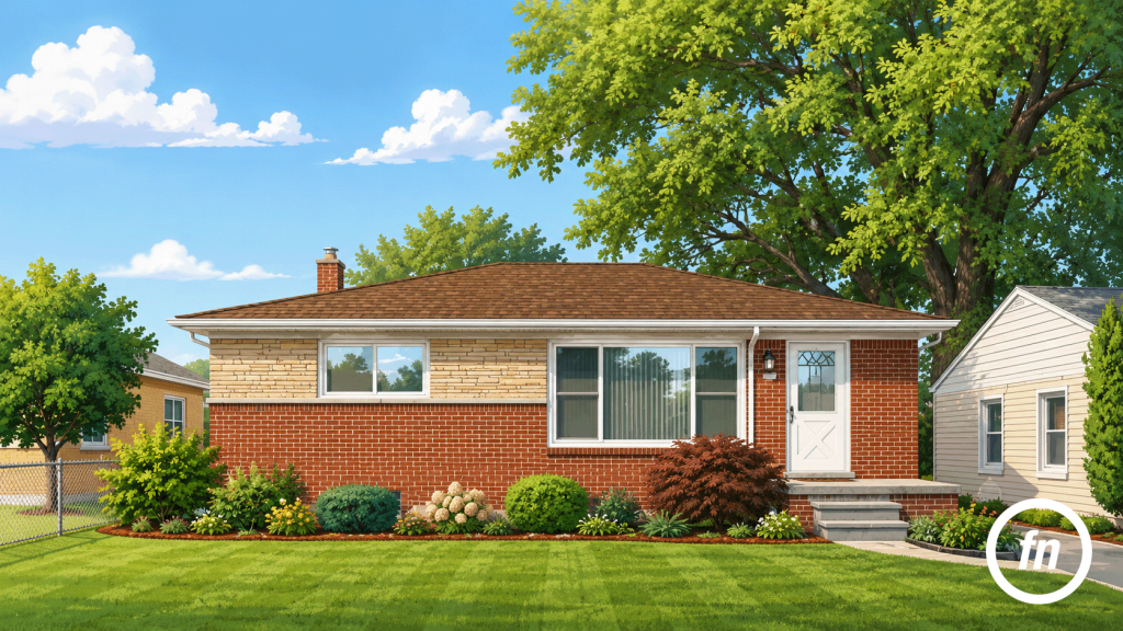
Brick has a way of tempting the camera into excess. Its color can be deepened, its mortar sharpened, its shadows lifted, and its contrast pushed until every joint appears to announce itself. On a small screen, the result may seem immediately impressive: a redder façade, a brighter lawn, a bluer sky, and a house that appears almost polished rather than photographed.
The trouble is that brick was never meant to look polished.
Its character comes from variation—the subtle difference between one course and the next, the darker faces created by firing, the pale mortar that has weathered unevenly, and the way a projecting sill or recessed joint catches light. When those differences are compressed beneath aggressive saturation and heavy tonal editing, the material may become louder while appearing less dimensional.
Eastpointe’s older residential fabric makes this restraint especially important. The city’s master plan describes neighborhoods composed largely of detached single-family homes, with bungalows, Cape Cods, ranches, and Craftsman-influenced houses appearing within a traditional street grid and beneath a mature tree canopy. Brick may move through those forms as a full façade, a lower course, a chimney, a porch base, or one material among several. It cannot be photographed as though every Eastpointe home presents the same surface or architectural story.
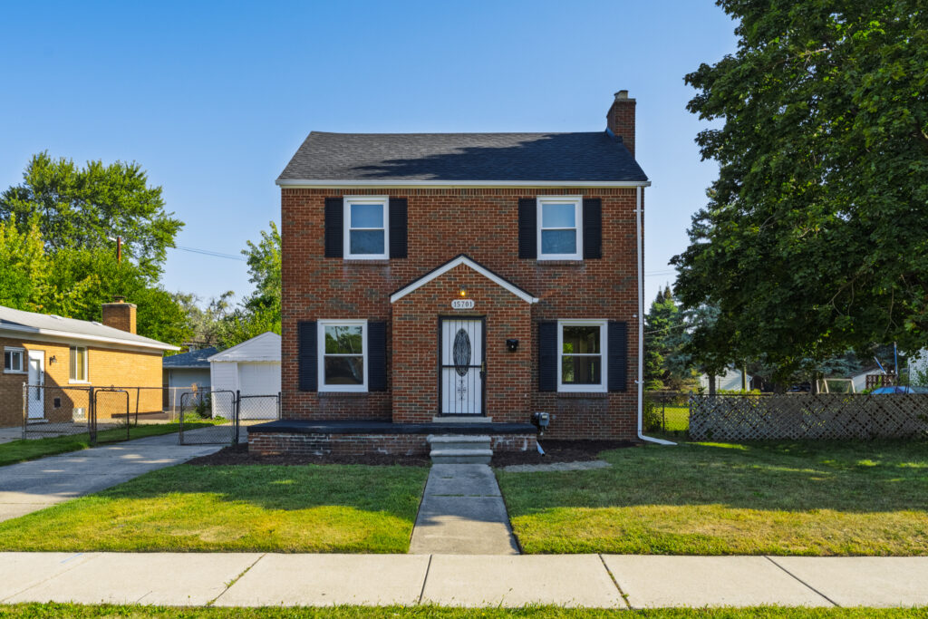
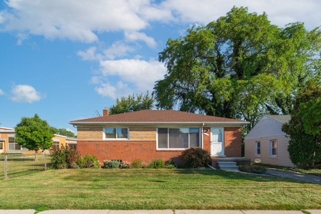
The two houses shown here make that distinction clear. One is a compact two-story colonial whose red-brick façade is organized around near symmetry, black shutters, white window trim, a small gabled entrance, and an elevated brick porch. The other is a low, horizontal ranch where red brick is paired with a broad band of lighter, elongated masonry, a large picture window, a shallow roof, and planting beds that soften the front elevation.
Both are brick homes. They do not ask to be photographed the same way.
Brick Is a Surface, Not a Color
The most common editing mistake begins with the assumption that brick should simply look redder.
In reality, a brick façade may contain brown, rust, burgundy, orange, charcoal, cream, and muted gray within a relatively small area. Mortar introduces another color, while shutters, siding, roofing, vegetation, and reflected sky influence how the material is perceived. Increasing global saturation may strengthen the dominant red, but it can also erase quieter variations and push the entire elevation toward a uniform orange or crimson cast.
The two-story Eastpointe home illustrates how much of the façade depends on relationships rather than color alone. Its black shutters give the windows weight, while white trim separates them from the darker masonry. The entry projection introduces another roofline and a subtle change in depth. Near the foundation, older brick and mortar remain visible beneath the porch, recording weathering that does not appear identically across the upper façade.
If the brick were edited as a single red field, those distinctions would weaken. The house might become more vivid, but the architecture would become flatter.
The ranch presents a different challenge. Its lighter upper masonry and red-brick base need to remain distinct without appearing as though they belong to different photographs. The stone-toned courses should retain their warm beige and buff variation, while the darker red brick below provides visual weight. Excessive warmth would turn both materials orange. Too much contrast would make the mortar lines brittle and give the façade an artificially sharpened appearance.
Good color correction begins by asking what kind of brick is actually present.
Natural Light Reveals the Mortar
Brick benefits from light that moves across the surface rather than striking it with equal intensity from every direction.
Soft directional light reveals the small recesses between brick faces and mortar joints. It allows projecting sills, lintels, porch edges, and chimneys to cast enough shadow to establish depth without losing detail. Early or later daylight is often useful because it tends to be less severe than overhead midday sun. Overcast conditions can also provide broad, even illumination, particularly when a façade contains glossy windows, pale trim, and dark shutters that would otherwise create extreme exposure differences.
Best practices entail of photographing exteriors when the sunlight is soft—early, late, or beneath cloud cover—because direct midday light can produce severe contrast and dark shadows.
Soft light does not mean flat light. A completely shadowless façade can make mortar joints and changes in plane difficult to read. The objective is to retain enough direction for the surface to remain tactile.
In the colonial photograph, the straight-on composition makes the orderly brick pattern part of the architecture. Light across the façade allows individual courses to remain visible without turning every joint into a hard line. The deep green tree canopy introduces shade along one side of the property, but the house itself retains enough tonal separation that the shaded roof and brighter brick do not feel like unrelated exposures.
The ranch depends more heavily on horizontal movement. Its shallow roof, broad picture window, long masonry bands, and lower planting bed pull the eye across the front elevation. Here, soft light helps the different brick colors remain cohesive while still revealing the transition between the lighter upper courses and the red base.
Light should explain those differences, not erase them.
Texture Comes From Contrast, Not Aggression
A small increase in local contrast can make mortar joints and brick faces easier to see. Too much clarity or sharpening, however, can create halos around windows, roof edges, tree branches, and individual masonry lines. The façade begins to look etched rather than dimensional.
The distinction is easier to understand when brick is compared with wood or painted drywall. On a smooth wall, increased contrast may reveal little beyond imperfections. On masonry, thousands of small edges are already present. Every brick, joint, chip, and shadow gives the editing software something to intensify.
This is why brick can look overprocessed before the rest of the photograph does.
A restrained workflow might slightly deepen the blacks in the shutters, recover highlights in the window trim, and add modest texture to the masonry while leaving the midtones relatively open. Selective adjustments are usually more convincing than applying one strong contrast setting to the entire image. The brick may need definition while the sky requires highlight recovery, the lawn needs only a small color correction, and the shadow beneath the porch needs enough lift to remain readable.
The guidance in 10 Things That Make Listing Photos Look More Professional applies directly here: exposure, color balance, straight verticals, and believable scale should work together. No single adjustment should become more noticeable than the house.
HDR Should Preserve Range, Not Flatten the Wall
HDR is useful when an exterior contains a bright sky, dark shutters, shaded landscaping, reflective windows, and a façade receiving uneven light. Multiple exposures can retain information that a single frame may lose. HDR is a way to combine scenes with a wider range between dark and bright areas, ensuring that important portions are neither blown out nor underexposed.
The problem is not HDR itself. It is what happens when every part of the frame is forced toward the same brightness.
When shadows beneath rooflines are opened too far, highlights are compressed, and midtone contrast is spread evenly across the image, brick can lose the very depth HDR was intended to preserve. Recessed mortar looks as bright as the brick face. The underside of a porch becomes nearly equal to the sunlit façade. Tree shadows disappear from the lawn, while the sky develops an intensity unrelated to the light on the house.
The photograph contains more visible information, but less believable light.
A finished real estate image should still have a hierarchy. The sunlit side of a chimney may be brighter than the shaded side. A porch recess should remain darker than the open lawn. Brick beneath the eaves should not have precisely the same luminosity as brick receiving direct light.
That variation is not an editing flaw. It is what gives the building form.
White Balance Protects the Brick’s Real Color
Brick is unusually sensitive to white-balance errors because its natural colors already sit near the warm end of the spectrum.
A photograph shifted too warm may turn red brick orange, cream mortar yellow, and pale siding beige. A correction pushed too far in the opposite direction can leave the masonry magenta or make warm stone appear gray. Reflected greenery may introduce a subtle green cast in shaded areas, while open blue sky can cool the upper floors or one side of a house.
The correct white balance is not always the one that makes every neutral surface perfectly gray. Exterior materials exist within ambient light, and some warmth or coolness may belong to the scene. The goal is to prevent the light from changing the identity of the material.
White window trim provides a useful reference, but it should not be treated mechanically. On the two-story home, the trim may reflect blue sky while the brick retains the warmth of direct daylight. Neutralizing the trim completely could make the masonry too warm. On the ranch, the white door and window frames sit beside both buff and red masonry, making it important to preserve the distinction between the two brick tones rather than applying one broad temperature shift.
The brick should look like brick, not like an editing preset applied to brick.
The Façade Still Needs Composition
Texture cannot compensate for a poorly chosen viewpoint.
The two-story colonial benefits from a nearly centered composition because the building’s organization is formal and balanced. Paired upper windows, paired lower windows, black shutters, a central entrance, and the small projecting gable create a visual order that a steep diagonal angle would weaken. Keeping the camera level also prevents the vertical sides of the house from leaning inward, which would make the upper story feel narrower than the base.
The ranch works differently. Its character lies in horizontality: the low roof, long masonry bands, wide picture window, and front planting beds. A broad, mostly frontal composition allows those lines to extend across the image. The surrounding lawn and mature tree establish the home’s scale without asking the property to appear isolated from its neighbors.
In both cases, the frame includes enough context to show how the house meets the lot. The driveway, walkway, fencing, landscaping, neighboring structures, and mature trees are not distractions by default. They explain the property’s setting.
The photographer’s task is to organize that context so the brick remains the principal material without turning the house into an architectural cutout.
Interior Brick Needs a Different Kind of Restraint
An interior brick fireplace, chimney, or accent wall presents a more controlled environment, but it also introduces stronger distortion risks.
A mostly head-on composition is often useful when the brickwork is symmetrical or when the pattern itself is important. A slight angle can reveal the depth of a hearth, mantel, return wall, or projecting chimney breast. What matters is that the camera does not move so far off-axis that rectangular bricks become dramatically tapered or mortar courses begin racing toward one corner.
A moderate wide-angle lens generally preserves the pattern more credibly than an ultra-wide view. The camera should also remain level so vertical brickwork does not lean backward. When the feature is close to a window, exposure must retain the brick’s shadow detail without lifting it until the wall loses depth.
Interior lighting introduces another complication. Warm bulbs can push red brick toward orange, while cool LEDs may produce purple or magenta shadows. A blended lighting approach or careful local color correction may be needed to keep the masonry accurate without neutralizing the entire room.
The principle is the same one explored in Historic District Listings Need Detail, Not Drama: material character becomes more persuasive when the photograph allows texture and craftsmanship to remain visible without turning them into theatrical effects.
Age Does Not Need to Be Edited Away
Older masonry is rarely uniform. Mortar may have been repaired in sections. Some bricks may be darker from weather exposure, replacement, or original manufacturing variation. Porch foundations can show different aging from upper walls. Chimneys may carry soot staining or softened joints that the main façade does not.
Editing should clarify those conditions, but it should not automatically remove every sign of age.
There is a difference between cleaning a temporary distraction and rewriting a permanent material. Removing a stray object from the lawn or correcting a sensor spot does not change the house. Digitally evening every mortar joint, cloning out weathering, or making replacement brick match original masonry may create a more uniform image while presenting a less truthful property.
That gap between the online listing and the in-person experience matters. NAR reports that 81% of buyers consider listing photos the most useful feature in an online home search, and its reporting on enhanced listing imagery notes that buyers may feel misled when highly polished photographs do not resemble the property they encounter. NAR’s professional standards also require advertising and online images to present a true picture rather than a deceptive or misleading result.
Restraint is therefore not simply an aesthetic preference. It supports credibility.
The Surrounding Colors Should Remain Secondary
Brick rarely appears alone. Green lawns, blue skies, black shutters, flowering beds, cream stone, white trim, and mature trees all influence how rich the masonry appears.
This creates another common editing problem: strengthening every color at once.
When the lawn becomes intensely green and the sky turns deeply blue, red brick often receives a corresponding saturation increase so it does not appear muted by comparison. The image then enters an escalating competition among colors. Nothing is allowed to remain quiet.
In the Eastpointe ranch photograph, the lawn and mature tree provide a broad green setting, while the warm roof and mixed masonry establish the home itself. The landscaping should appear healthy and recognizable, but it should not become more visually dominant than the façade. In the colonial photograph, the clear sky creates a strong field of blue above the red brick. Preserving a natural sky keeps the complementary colors from feeling artificially heightened.
The house should remain the reason the photograph exists.
An Eastpointe Brick Home Should Still Look Like Itself
The strongest editing does not leave brick untouched. It corrects perspective, balances exposure, refines color, restores highlight and shadow detail, and gives the material enough local definition to retain its pattern. What it avoids is the assumption that professional photography must make every surface cleaner, brighter, redder, and more dramatic than it appeared on site.
In photographing these two Eastpointe homes, I approached the brick according to the architecture around it. The colonial called for a composed, nearly symmetrical frame that respected its vertical proportions, paired windows, dark shutters, and central entrance. The ranch required a wider reading of the façade, allowing its horizontal roofline, mixed masonry, picture window, planting bed, and broad lawn to work together.
Neither home needed a filter to manufacture character. The character was already present in the masonry, proportion, light, and relationship to the lot.
The same measured approach shaped An Eastpointe Bungalow, Read Without Embellishment. Although 20947 Beechwood is clad primarily in siding rather than brick, the case study rests on the same principle: a property becomes more persuasive when its actual materials and proportions are presented clearly instead of being pushed toward a different kind of house.
Brick should have depth. Mortar should remain visible. Color should feel rich without becoming artificial. Shadows should help describe the wall instead of being erased from it.
An Eastpointe brick home does not need heavier editing to appear valuable. It needs light and processing subtle enough to let the material speak.
