
Project: 20947 Beechwood, Eastpointe, Michigan
Client: Bryan Harman, Propel Property Management
Scope: Exterior and interior real estate photography
At 20947 Beechwood, the first impression is not one of architectural spectacle. The house sits close to the street beneath a steeply pitched roof, its pale siding broken by blue metal awnings, a small covered entry, and the practical geometry of a driveway running alongside the home. It is a familiar Eastpointe bungalow: compact, direct, and built around everyday usefulness rather than ceremony.
That modesty is precisely what makes the photographic assignment interesting.
Some listings arrive with an obvious visual hierarchy. A renovated kitchen, vaulted living room, landscaped backyard, or dramatic façade immediately announces where the camera should linger. Here, there is no single luxury feature expected to carry the gallery. The home is vacant, the rooms are lightly finished, and much of its character emerges slowly through proportion, circulation, and the unexpected amount of space contained beneath the roof.
The photography therefore has a different responsibility. It does not need to transform the property into something more elaborate. It needs to help a buyer understand what is already there.
The Exterior Establishes the Scale
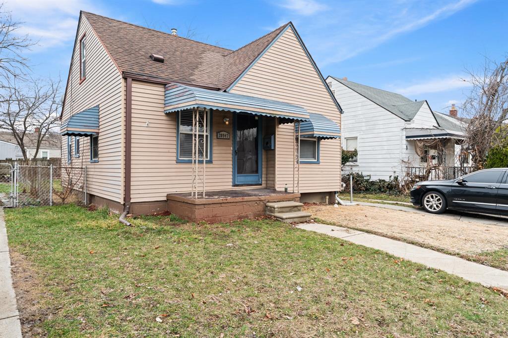
The lead image introduces the house from a slightly angled position, allowing the front elevation, entry, roofline, lawn, and driveway to share the frame. Enough of the neighboring homes remain visible to establish the residential scale of the block, but the composition keeps 20947 Beechwood at the center.
There is value in that directness. The front yard is not lush, the trees are bare, and the season offers little decorative assistance. Rather than compensate with excessive saturation or a dramatic low angle, the photograph depends on level geometry and even exposure. The roof retains its texture. The pale siding remains distinct from the sky. The blue awnings and trim provide a restrained line of color without being pushed beyond what the eye would naturally see.
The result is not a postcard version of the home. It is an accurate introduction.
That distinction is especially important for a modest property. An exaggerated lens can stretch a compact façade until the house appears wider than it is, while too much foreground can make the lot feel larger or more distant from the street. Here, the camera shows enough lawn and driveway to explain the site without allowing either to overwhelm the architecture.
Good Eastpointe real estate photography begins with that kind of proportion. The image should attract attention, but it should also prepare the viewer for the scale of the property they will encounter inside.
The Front Door Opens Directly Into the Living Room
There is no formal foyer separating arrival from the main living space. The front door opens into a simple rectangular room with two windows, hardwood flooring, pale walls, white trim, and a floor register positioned beneath the larger window.
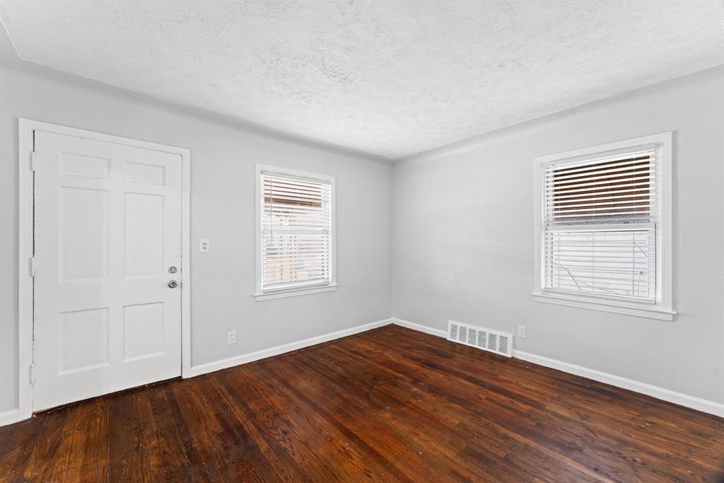
In a furnished home, a sofa, rug, or television might establish how the room functions. Vacancy removes those cues. The photograph must instead rely on the placement of doors, windows, walls, and floor area to explain how the room could be used.
The living-room image succeeds because it does not try to fill the frame with width alone. The front door remains visible, preserving the relationship between the exterior and interior. Both windows establish the direction of daylight, while the hardwood floor provides warmth and material contrast beneath the otherwise neutral room. The camera sits low enough to keep the space grounded, but not so low that the ceiling begins to dominate.
An empty room can appear deceptively simple to photograph. In reality, vacancy exposes every compositional decision. A tilted wall, uneven camera height, or unnecessarily wide focal length becomes immediately apparent because there is no furniture to redirect the eye.
This is where the principles discussed in 10 Things That Make Listing Photos Look More Professional become especially relevant. Straight verticals, balanced camera height, and a restrained wide-angle lens are not technical flourishes. They are what allow the buyer to judge the room with confidence.
Vacancy Makes Proportion the Main Subject
The bedrooms continue that visual language. Each one is largely defined by hardwood flooring, pale walls, white doors, and the position of its windows and closets. There are no decorative layers to distinguish one room from another, so the photographs must reveal the differences that matter.
One bedroom receives light from two directions, giving the room a brighter, more open quality. Another is narrower and more enclosed, with a window at the far wall that pulls the eye through the room. A third view shows how a closet and doorway affect usable wall space.
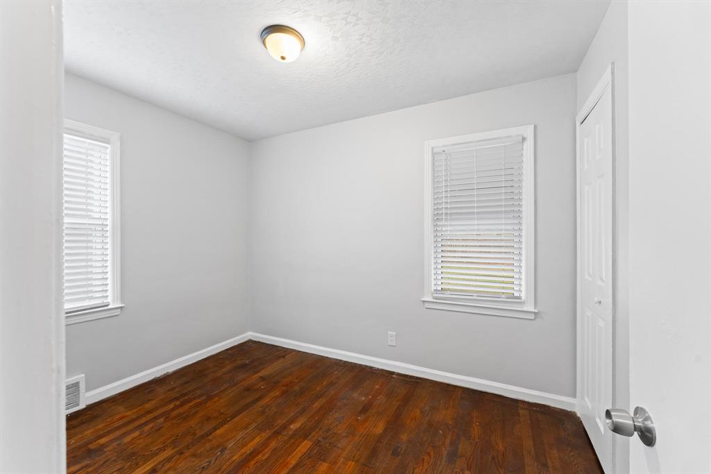
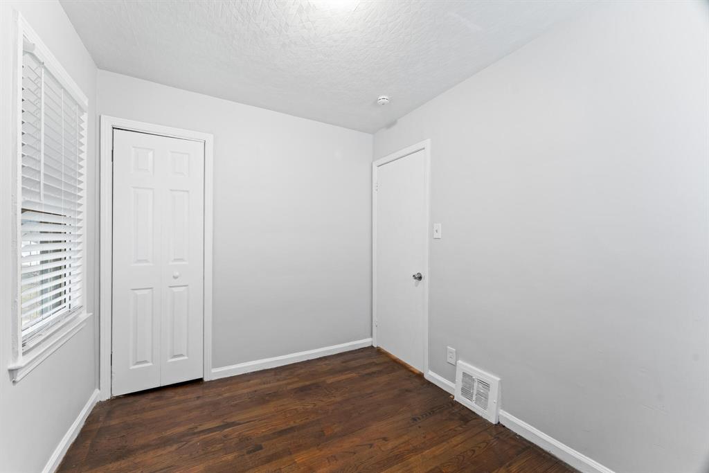
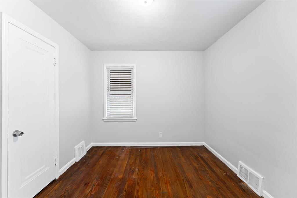
These are modest differences, but they are practical ones. A buyer looking at an empty bedroom is not only asking whether the room is attractive. They are trying to determine where a bed might fit, whether a dresser would block a doorway, how much wall space remains, and whether the room could function as an office, nursery, or guest room.
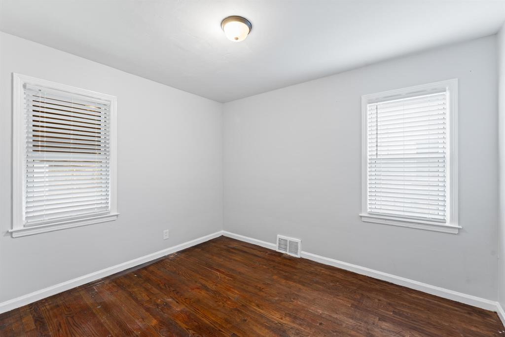
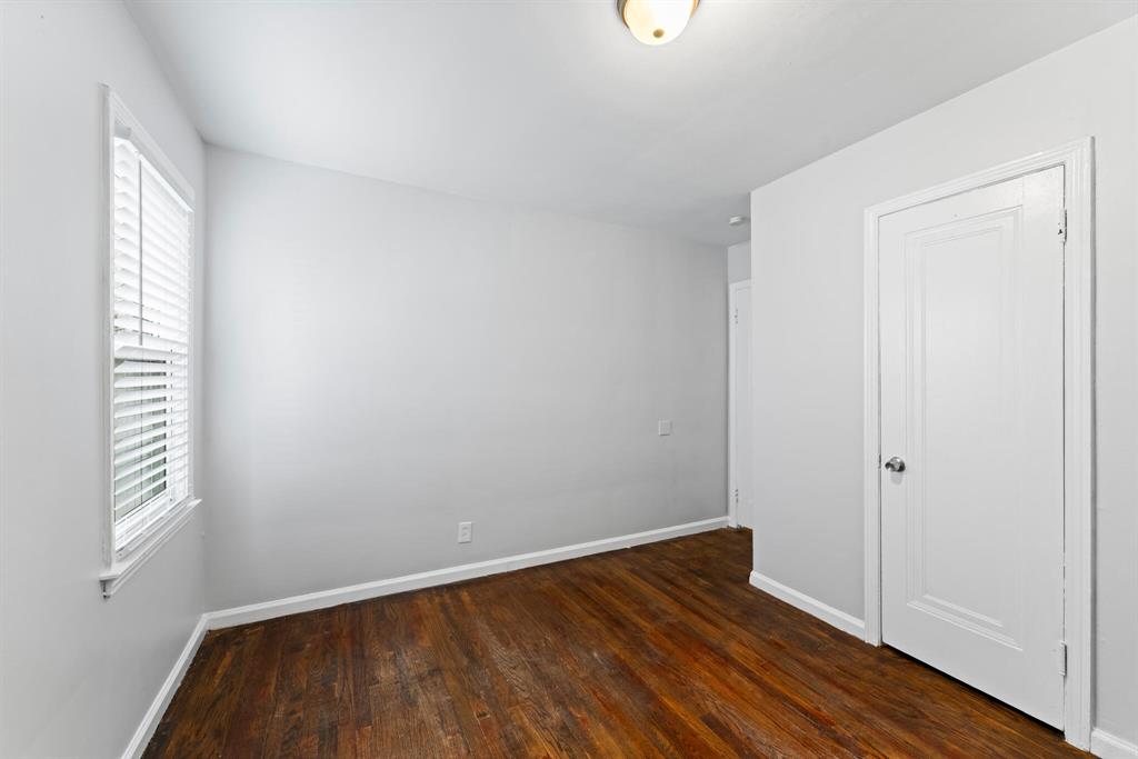
Aggressive wide-angle photography would make those judgments harder. The room might initially appear larger, but stretched corners and elongated floors would create expectations that would not survive an in-person visit. The photographs instead allow the bedrooms to remain compact and believable.
That credibility matters. Professional photography is sometimes described as a way to make a house look its best, but the more useful goal is to make the house easier to read.
The Kitchen Is Small, but Its Organization Is Clear
The kitchen is a narrow, practical space arranged around two opposing working zones. The range and refrigerator occupy one side, while white cabinetry, a sink, stone-patterned counters, and a mosaic backsplash run along the other. A shallow peninsula extends into the room, creating additional work surface without becoming a formal island.
Two views are necessary because no single angle explains the entire arrangement.
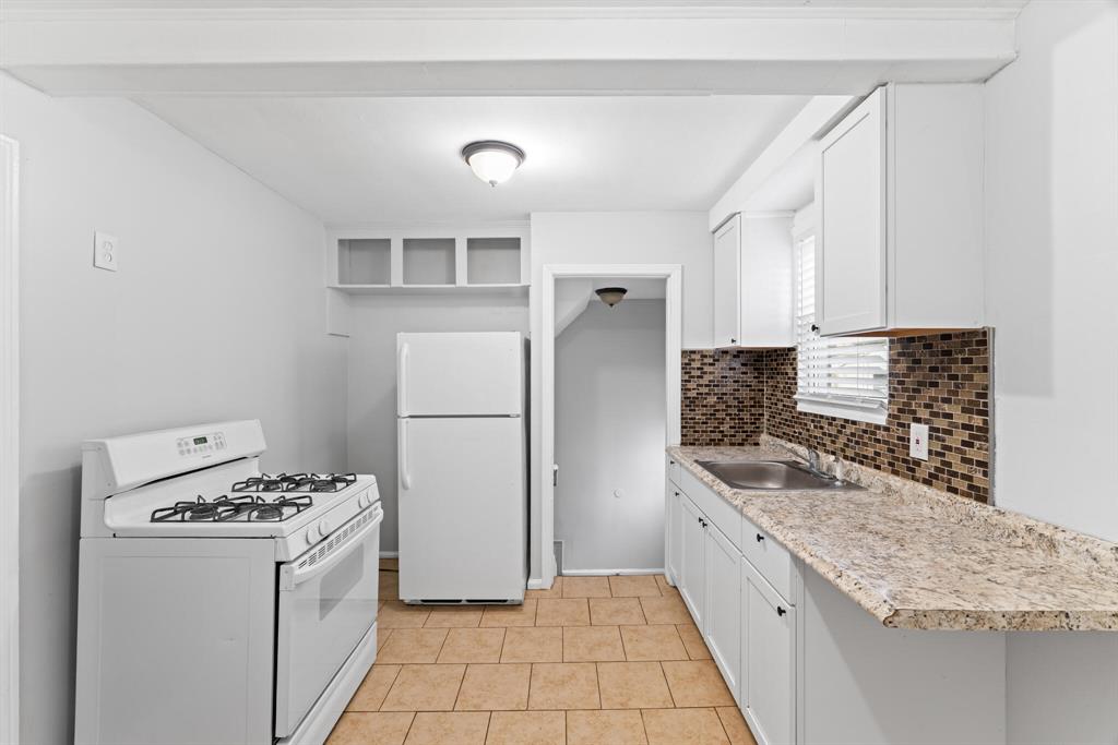
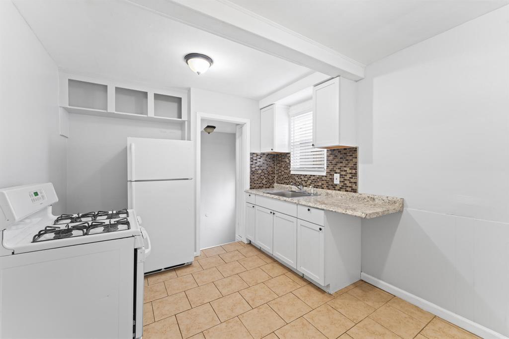
The first photograph looks directly into the kitchen and establishes the primary work sequence. The range, refrigerator, counter, sink, window, and rear doorway are all visible within one composition. The second image steps back slightly, allowing the peninsula and open floor area to become more apparent.
Together, the images answer different questions. One explains how the appliances and cabinetry are organized. The other shows how someone would move through the room.
This is a useful example of why multiple angles should add information rather than simply repeat a space. The second photograph is not included because every kitchen automatically requires two images. It earns its place by revealing the relationship between the counter, wall, doorway, and circulation path.
The room is also a study in tonal control. White appliances, white cabinets, pale walls, and white trim could easily merge into one bright surface. Careful exposure preserves separation among them, while the tan flooring and darker backsplash prevent the kitchen from feeling visually flat.
There is no need to describe the room as a chef’s kitchen or an entertaining centerpiece. Its value is more straightforward: the layout is understandable, the surfaces are visible, and the buyer can see how the room functions.
The Bathroom Is Shown Honestly
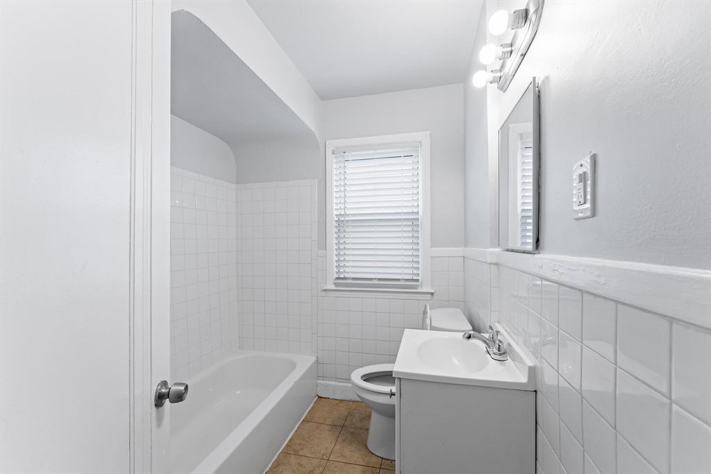
The bathroom is narrow, with the tub positioned along one wall and the toilet and compact vanity arranged beneath a window and mirror. The photograph is made from the doorway, where the entire sequence of fixtures can be understood in one frame.
A small bathroom is one of the easiest places to overuse a wide-angle lens. The temptation is to force every fixture into view while creating as much apparent distance as possible. Here, the composition, shot at 14mm includes the full room without asking it to appear expansive.
The tiled walls, floor, window, vanity, mirror, and lighting remain visible, but the room retains its actual proportions. It reads as compact, functional, and bright.
The photograph also demonstrates how preparation and photography work together. In a room this small, every visible object becomes more prominent. A raised toilet lid, toiletries, towels, or cleaning supplies can occupy a surprising amount of visual attention. That is why seller-preparation guidance is not separate from the photographic process. It directly affects how clearly a room can be presented.
Upstairs, the Roofline Becomes the Architecture
The finished attic is the house’s most unexpected space.
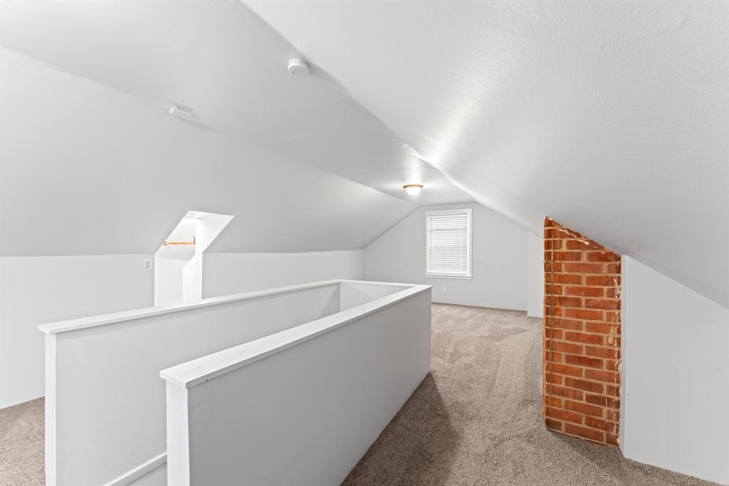
From outside, the steep roof suggests usable volume above the main floor, but the photographs reveal how fully that volume has been claimed. The room extends beneath long sloped ceilings, with carpet running from one end to the other. A central stair enclosure divides the space without closing it off, while a brick chimney rises through the room as the only strong material contrast.
The architecture here comes from shape rather than ornament.
One view introduces the attic from the stair opening, showing the chimney, low perimeter walls, and changing roof planes. Another reverses the direction and reveals built-in drawers set into the lower wall, a practical response to the limited height beneath the eaves. A more centered composition emphasizes the symmetry of the ceiling slopes, while the side angle shows the amount of floor area available around the stair enclosure.
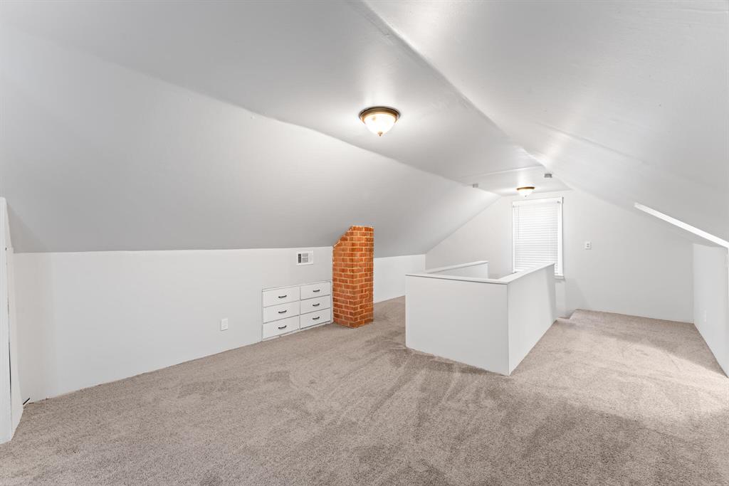
This is where the gallery changes pace. The main floor has been defined by compact rectangular rooms and familiar finishes. Upstairs, the house becomes longer, lower, and more spatially ambiguous. The viewer needs several photographs because the room cannot be understood from one corner.
The exposed brick chimney becomes a visual anchor, but it does not need to be romanticized. It is neither a grand fireplace nor a decorative installation. It is a structural element that gives the pale room texture, scale, and a point of orientation.
The attic’s appeal lies in possibility. It could accommodate sleeping, work, storage, recreation, or some combination of uses, but the photographs do not prescribe one. Because the room is empty, the buyer is allowed to study its geometry before imagining a purpose.
The Basement
The lower level introduces another kind of space. Drop ceilings, fluorescent light panels, painted floors, paneled walls, dark base trim, storage cabinetry, and a small built-in counter give the basement a utilitarian character distinct from the floors above.
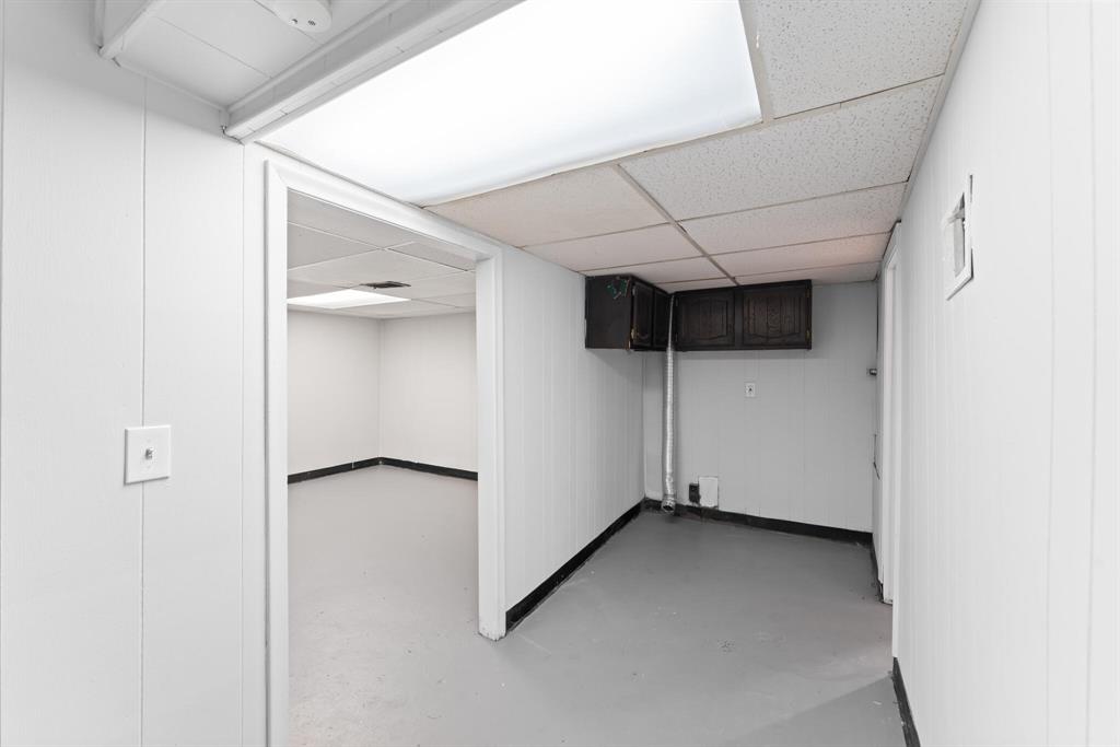
The photography does not attempt to erase that difference.
One image looks through a narrow connecting area into a larger room, showing how the lower level is divided. Another includes the counter, cabinets, support posts, and open floor area. A third isolates a simpler room with paneled walls and overhead lighting.
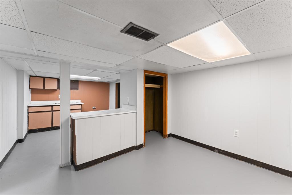
These photographs are useful because they reduce uncertainty. A buyer can see that the basement offers additional usable areas, but also understands its present level of finish. The lighting is bright enough to reveal the rooms without making them appear newly renovated. The ceiling panels, vents, cabinetry, and transitions remain visible.
That honesty gives the images value. A basement does not have to resemble the main living floor to strengthen a listing. It may contribute storage, a workshop area, laundry space, recreation, or future flexibility. The photographer’s job is to show what it adds without disguising what it is.
The Backyard Completes the Site
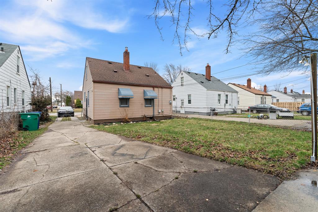
The final exterior image shifts to the rear of the property, where the relationship between the house, driveway, fenced yard, and neighboring homes becomes clear.
The backyard is open and largely unadorned. There is no elaborate patio, mature garden, or staged outdoor room. What the image provides instead is site information: the depth of the lawn, the width of the driveway, the position of the rear elevation, and the spacing between surrounding properties.
That makes it a useful counterpoint to The Small Backyard Has Become a Selling Room. Some yards arrive already organized around seating, dining, or recreation. Others offer something more basic but still meaningful—a defined outdoor area with room for a future owner to decide what comes next.
The image does not need to manufacture a lifestyle scene. It simply needs to show the space clearly enough that the buyer can begin imagining one.
Professional Photography Is Not Only for Remarkable Houses
At 20947 Beechwood, the value of professional photography is not found in drama. It is found in sequence.
The exterior establishes the home’s compact footprint and relationship to the street. The living room introduces the main floor. The kitchen reveals its work pattern through two complementary views. The bedrooms are kept believable rather than artificially widened. Upstairs, the finished attic becomes the property’s most surprising space. The basement adds utility, and the rear photograph completes the understanding of the lot.
Nothing has been asked to become more luxurious, more expansive, or more architecturally significant than it is.
That is the strength of the presentation.
A modest house often needs photography as much as a high-end property because it has fewer obvious visual cues with which to hold attention. When there is no staging, design vocabulary, or dramatic renovation to guide the eye, composition has to work harder. The rooms must be sequenced carefully. The camera must remain level. Exposure must distinguish pale surfaces from one another. Each photograph must answer a question rather than simply occupy space in the gallery.
The most successful images of 20947 Beechwood do not transform the bungalow. They make it understandable.
For this house, that clarity is not a lesser form of marketing. It is the entire point.
